Creating a Map showing age group data using graphics
This example describes how to show a ratings scale by age, with the age data conveyed in the graphic, and the satisfaction statistics displayed by color.
It uses the questions available in the Crocodile Rock Cafe survey.
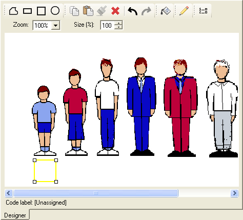
Adding graphics to represent each age group
- Create an image representing the different age groups used to classify respondents.

In the Crocodile survey, these are:
Under 18 | 18 – 24 | 25 – 34 | 35 – 44 | 45 – 54 | Over 55 |
- Ensure that you have enough space to display the analysis data on the image. The size of the image will be the size of your Map.
- Save the image file in a known place (eg styles/map/age_pic.gif)
- Click
 to define the analysis.
- Enter Q9 (age) in the Analysis field.
- Select Means and Significances in the drop-down list. Enter Q6a (speed of service satisfaction rating) in the field for the variable for which the mean is calculated. (If you wished to score the mean, you would enter the score in the field after the variable name, e.g. q6.a score5).
- Click OK to save the table. Keep the window open for reference while creating your Map.
- Select the table in the Analyses window and click
 on the toolbar to duplicate the analysis.
 - Select Map in the Type list.
- Select <Create new style> from the dropdown list of styles. The Map Control Editor opens.
- Select File|Import image and browse for the image you have created.
- Click
 to select the square tool, and draw a square under one of your figures.
- Use Copy and Paste to duplicate the square until there is one under each figure.
- Select each square in turn and select Shape|Assign to code. Select the appropriate code for the figure. (You can also right-click the shape and assign codes from the context menu.)
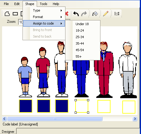
As you assign codes, the analysis data will automatically be calculated and used to fill the square.
Assigning RGB colors and legends for the least and most satisfied age groups
-
Click
 to open the Map Control Editor Fill series dialog.
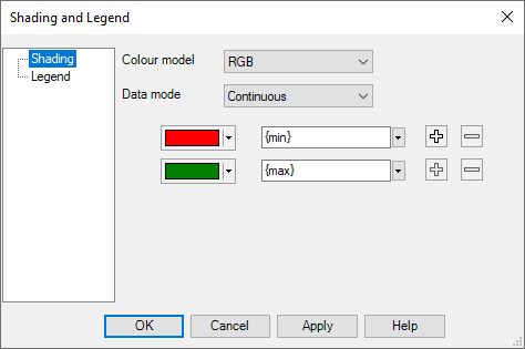
- Select RGB as the color model. This means that intermediate colors will be calculated as if you were moving round the colors in a rainbow.
- Select Continuous as the Data Mode. This means that every value will be assigned a color according to its data value.
- Click the color buttons to assign colors to represent the maximum and minimum values.
- Select Legend in the left-hand pane.
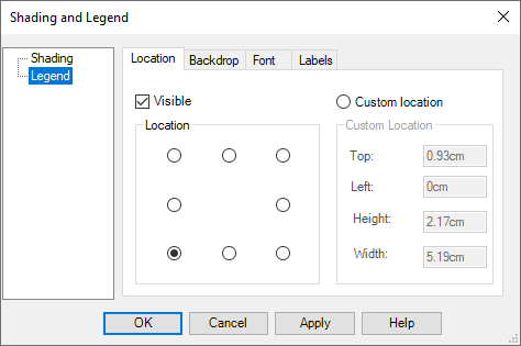
- Check the Visible box to display the Legend, and select one of the radio buttons to position it.
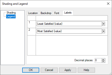
- Click the Labels tab.
- You will have the same number of labels fields as colors listed in the Shading window. By default the text for each color is the value it represents. Add some text to identify what the Map is displaying.
- Click OK.
- When you have finished defining the Map, select File|Save map control and save your Map as an .isf file.
- Click OK to display the completed Map analysis.