Buttons settings
The Buttons section specifies the buttons that are used in the interview and the appearance of the buttons.
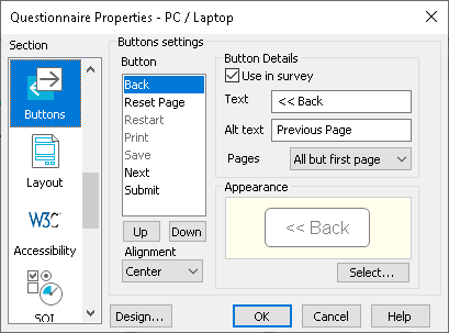
| Button | Specify which buttons appear on the survey page, and how they look. They always appear in the following order. |
| Back | Go to previous page. |
| Reset Page | Clear all respondent’s entries on this page. |
| Restart | Close the current interview and restart the survey. |
| Print the current page. | |
| Save | Save the current state of the survey. |
| Next | Go to the next page. This is always used. |
| Submit | Submit the survey. This is always used. |
| Use in survey | Check to use the selected button in the survey. |
| Text | Plain text that appears on a basic button. |
| Alternative text | If an image is used, this text is used as the ALT text for the image which is displayed if the image is not available. |
| Pages | Select which pages of the interview the selected button is displayed. |
| Appearance | Specify an individual image used to represent the selected component. You can also select a plain text representation of the button. You do not need to specify individual images if you are using a design. |
| Alignment | Position of the buttons on the toolbar (the same setting applies to all the buttons). |
| Design | Open the Navigation Design dialog to specify the scheme used for the tool bar area (button and toolbar colours, and whether the progress bar is present). |