Tables and charts showing means and significances
The significance is calculated by comparing the mean of one category with another using the t-test. The t-test establishes the significance of the fact that the mean for a particular cell is greater than, or less than, the mean of a reference cell. The reference cell may be the analysis base (the mean of all respondents in the same row) or the break base (the mean of all respondents in the same column).
The only response types that can be used in means and significances tables/charts are Single Response and Quantity Response.
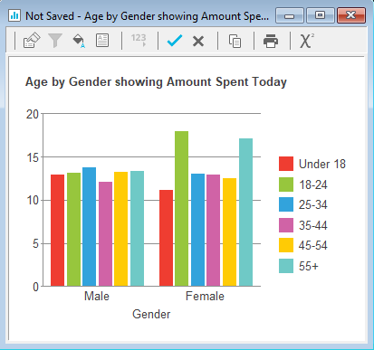
For example, in the Crocodile Rock Cafe survey it might be required to see whether there is a significant difference in spending in a comparison of men and women who are in the same age bracket or, alternatively, it might be necessary to look at whether there is a significant difference between the amount spent by men in different age categories and the amount spent by women in different age brackets. In other words, the first example will compare men and women of the same age, whereas the second example will compare men in age categories and there will be a separate comparison between women in age categories.
- Click
 to open the Analysis Definition window to build a table.
 - Specify the Analysis variable for the table or chart as Q11 (Age categories).
- Set the Break variable for the table or chart as Q12 (Gender).
- Set Calculate to Means & Significances.
- Specify the Calculate variable as Q5 (Amount spent).
- The Show options in the Analysis Definition now show significance options.
- Choose Analysis Significance if you want to see a comparison of means between men and women.
- Choose Break Significance if you want to see a comparison between men of different age groups and a separate comparison of women of different age groups.
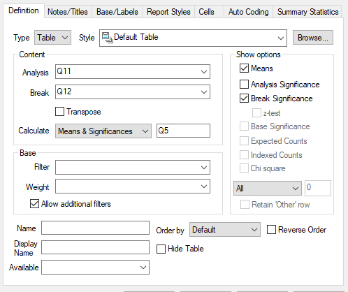
- Click OK to build the table
Each cell in the table shows the average amount spent and the significance of that value compared with every other mean in either the same column or the same row, depending on whether Analysis Significance was selected, or Break Significance.
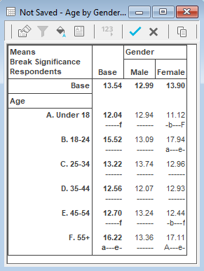
The table displays Break Significances. You can see that there are highly significant differences between the means of females aged under 18 and those who are 55+. Amongst men, there are no significant differences. The table also displays any significant differences between the base means (all respondents) for each age category.
Converting to a chart
On a chart you can show either the mean or the significance but not both.
- To convert this table to a chart format, click
 .
. - Uncheck the Break Significance option.
- Change the form from Table to Chart and from the drop-down menu select the style Bar Counts.
- Click OK to build the chart.