Tables and charts showing means and differences
Tables and charts of means and differences can be built. For example, in the Crocodile Rock Cafe survey it might be required to see how much is spent by men and women of different age groups in comparison with each other. This can be either comparing men and women of the same age group or comparing all men in the different age groups and separately all women in the different age groups. This is the same table we showed in the example of means and significances but this time rather than seeing if there is a significant difference, we are calculating what the difference in the means is.
The only response types that can be used in means and differences tables/charts are Single Response and Quantity Response.
- Click
 to open the Analysis Definition window to build a table.
 - Specify the Analysis variable for the table or chart as Q11 (age categories).
- Specify the Break variable for the table or chart as Q12 (gender).
- Select Means & Differences as the Calculate option.
- Specify the Calculate variable as Q5 (amount spent).
- The Show options on the Analysis Definition change to difference options.
- Choose Analysis Difference if you want to see a comparison of the means and difference of men and women of each age group.
- Choose Break Difference if you want to see a comparison of the means and difference of men in each age category and a separate comparison of the means and difference of women in each of the age groups.
- Choose Base Difference if you want to see a comparison of the means of each cell with the base mean.
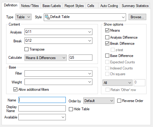
- Click OK to build the table.
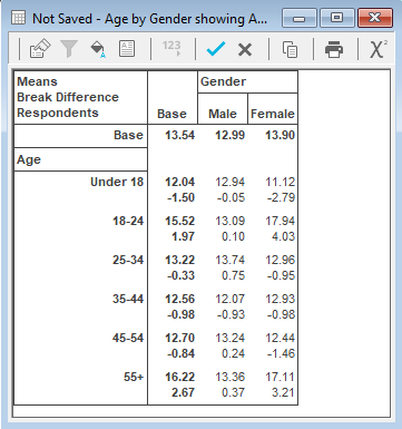
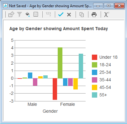
This example displays Break Difference so you can see the mean amount spent by men of each age category compared with the overall mean of amount spent for men. We can also see the mean amount spent by women of each age category compared with the overall mean of amount spent for women.
Converting to a chart
The difference values can usefully be displayed in the form of a 2D bar chart:
-
Click
 to re-define the table and change the form to have the Bar Counts style.
- Uncheck the Means box and click OK to build the chart.