Layout settings
Layout
The Layout section allows you to specify which standard components, such as a logo or title, appear on every page of your survey and how they look.
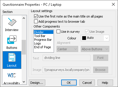
| Use the first title as the main title on all pages: | Check to make the title on the first page appear on all subsequent pages. |
| Add progress text to browser tab | Add progress text to the header of the browser tab |
| Other components | Specify which components appear on every survey page, and how they look. |
| Divider | Text or a graphic (normally a line) that separates the questions from the button area (left right or centred). Selecting this unselects Tool Bar. |
| Tool Bar | A background color or image used to define the area where the buttons are. Selecting this unselects Divider. |
| Progress Bar | A graphic or text showing respondents how far through the survey they are (appears where specified). |
| Logo | Company logo that appears on the tool bar (left right or centred). |
| End of Page | Text, a line or a graphic that appears below the tool bar (left, right or centred). |
| Use in survey | Check to use the selected component in the survey. |
| Use Image | If checked, use the image specified in Image to represent the component. If clear, use the text specified in Text. |
| Image | Specify the image used to represent the selected component. |
| Text | Text that is used to represent the selected component. You can insert HTML codes between angle brackets. E.g., to insert an HTML horizontal line, type <<hr>>. If the Image box has been checked, this text is used as the ALT text for the image (displayed if the image is not available). |
| Alignment | Specify the position of the selected component (image or text) on the toolbar. You can specify the position of the Progress Bar on the page using the secondary drop-down list. |