Adding tables
Tables show the response data in a grid structure using rows and columns, where each cell contains specific information. This helps the dashboard users understand the responses to the survey.
There are four table layouts available.
- Crosstab is also known as a contingency table. It shows the relationship between two or more categorical variables, such as comparing age by department.
- Frequency tables show the frequency distribution of various categories or values in the data responses, commonly used to show one-variable data.
- Grid tables display related variable data in rows and columns.
- Statistics tables provide a quick overview of key statistics, such as the mean, median, standard deviation, and count for different variables.
Insert a table
- Open the dashboard and select the Insert widget menu.
- In the Tables menu, select the table and drag to the dashboard editor. This adds the table to the dashboard and opens the table settings.
- In Title, enter the title description for the table .
- The Type defaults to the table type you selected in the menu, but you can change the table type to any of the available charts or tables.
Table settings
There are four tabs: Definition, Calculate, Include and Style.
- The Definition tab defines which data is used in the table .
- The Calculate tab gives the option to select how the data is calculated.
- The Include tab gives the option to include responses with errors, not asked or no reply.
- The Style tab gives the option to display a shadow and customise the padding.
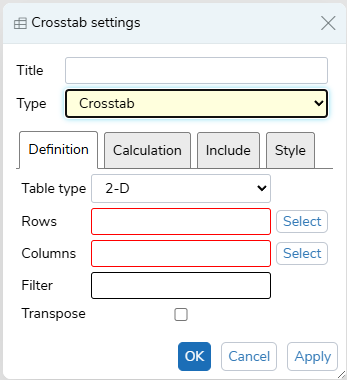
Definition
Each table definition is set to the default for its table type, when created. You can change the Type to the options:
- 2-D includes both Rows (Analysis) and Columns (Break)
- 1-D includes Rows (Analysis)
- Grid
- Descriptive statistics
- In Rows (Analysis), click the Select button and choose a variable from the list, then click OK. You can select more than one variable.
- In Columns (Break), click the Select button and choose a variable from the list, then click OK. You can select more than one variable.
- In Filter, enter the filter criteria, e.g. Q1=2
- Select Transpose, if you want to transpose the table .
Calculate
This tab determines how the data is calculated.
For the Crosstab, Frequency and Grid tables:
- Choose the Cells option from Counts, Row persents, Column percents or Total percents
- Choose the Base option from Response or Respondents.
For the Statistics table:
- Select the statistics from Count, Sum, Mean, Min, Max, Range.
- Choose the Base option from Response or Respondents.
Include
- Select Errors if you want to include data with errors
- Select Not Asked if you want to include data that was not asked
- Select No Reply if you want to include data that had no reply
Style
In the Style tab, you can set the shadow and padding.
Save and Apply
- Click OK to save all the changes.
- Click Apply to apply the changes.
- Click Restore to return to the original values, if the chart was edited.
- Click Cancel to abandon the changes.
Resize the table
You can resize the table box by dragging the resize arrows.
Examples
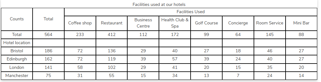
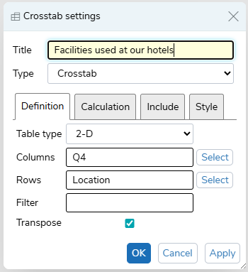
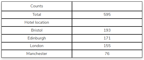
Crosstab
The Crosstab table displays the number of guests that used each facility at the hotel they visited.
The Columns show Q4, the facility used, and the Rows show the hotel location, with the Transpose option set.
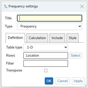
Frequency
A simple Frequency table showing the guest count at each hotel location.
The Rows are set to the location, and other options are left as the default settings.
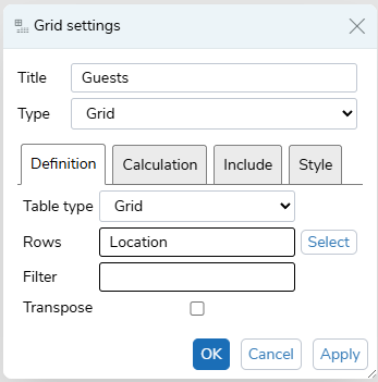
Grid
The Grid table showing the guest count at each hotel location.
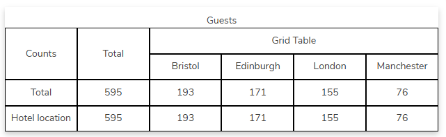
The Rows are set to the location, and other options are left as the default settings.
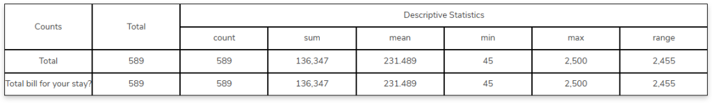
Statistics
The Statistics tables shows the count, sum, mean, min, max and range for the total bill.