Displaying counts and percentage figures on a bar chart
Bar charts normally display one value per bar. You can choose whether this is:
- the count (number of respondents who chose that response)
- the percentage (number of respondents as a percentage of the total)
If you want to display both the counts and the percentage value, you need to pass in the counts and use the Chart Designer to calculate the percentages from the counts.
To ensure that the chart designer uses the number of respondents as its value for 100%, you must pass in a variable or variable code containing that value. This is done by creating a derived variable which has a code that is true for all respondents. This code then has a count value of the number of respondents.
You can then exclude this code from the final bar chart. You can only exclude codes from terms in the Analysis field that have not been transposed.
-
Click
 on the Snap toolbar to open the Variables window.
- Select the variable you wish to chart. Here we are using Q2.
-
Click
 on the Variables window toolbar to create a copy of the variable.
- Set the Type to Derived. (The values in this variable are derived from the answers to Q2.)
- Set the Name to V2Q2 to remind you that it is derived from Q2.
- Set the Response to Multiple, so that you can have more than one code selected.
- Select to the Values column for the first code Daily and enter Q2=1
- Repeat for the other codes in Q2.
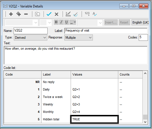
- Create an additional code and name it Hidden total. Set the value to TRUE.
-
Click
 on the Variables window toolbar to check the number of responses for the parts of your new variable.
- You will get a message warning you that this will cause any changes to be kept. Click OK. The counts are displayed. The count for Hidden total should be the same as the base value in your table.
-
Click
 to save your variable.
Create the chart
-
Click
 on the Snap toolbar to create a chart.
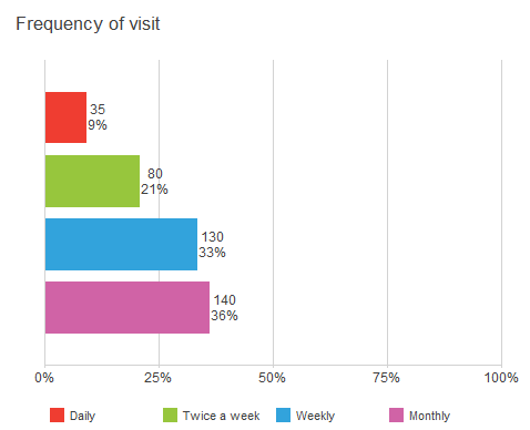
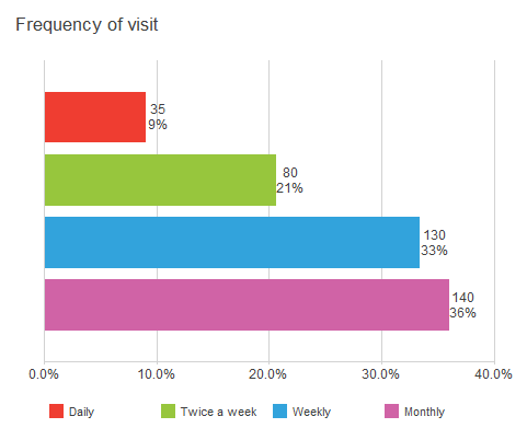
- Set the style to Horizontal Bar Counts and set the analysis to V2Q2.
- Check Counts.
- Click Apply to display your chart.
- Double click on the Hidden total bar to open the Chart Designer and check the Exclude series box to stop the display of that bar.
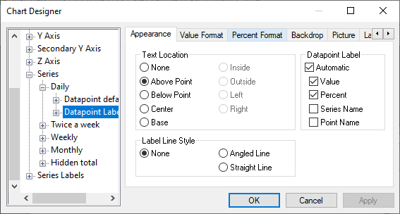
- In this type of chart, each of the bar heights is a datapoint in a series. In the left hand pane, double-click Series to open it, then Daily then select Datapoint Labels defaults.
- Select the Above Point radio button as the Text Location in the Appearance tab. This specifies where the counts and percentage figures will be placed.
- Check Value and Percent under the Datapoint Label. This will display the counts and percentage figures at the end of the bar.
- Repeat for the other series that you wish to display (Twice a week, Weekly and Monthly).
- Click Apply to display the new version of the chart.
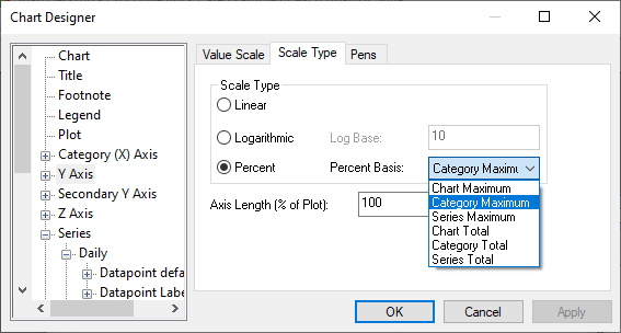
- The percentage values are not correct as they have not been calculated using the Hidden total value. Select Y Axis in the left hand pane of the Chart Designer dialog.
- Select the Scale Type tab and select the Percent radio button.
- Select Category Maximum as the Percent base. This uses the highest count as the number to calculate the percentages from. In this chart, it is the value in Hidden total, the same as the respondent base.
- Click Apply.
Further changes can be made using the Chart Designer to give your chart the desired look.
Change the way the labels on the y-axis are displayed
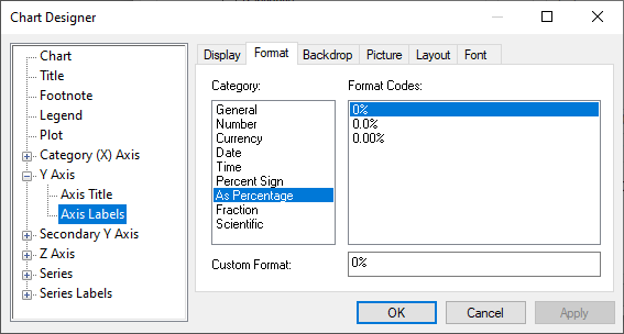
- Select Axis Labels under Y Axis in the left hand pane of the Chart Designer dialog.
- Select the Format tab in the right hand pane.
- Select 0% as the Format Code.
- If you wish to make the y axis maximum 100%, select Y Axis in the left hand pane.
- Clear the Automatic box.
- Change the Maximum to 1.
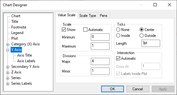
- Click OK.