Creating Analyses
Analyses, such as tables and charts, help you examine and interpret the survey’s response data. In Snap XMP Online, you can create tables, charts, lists and word clouds in the Analyze section.
There is also an accompanying analysis webinar that demonstrates how to create the analyses in Snap XMP Online.
Opening the Analyze section
There are two ways of opening the Analyze section.
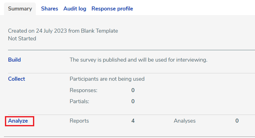
- In Your work, select the survey to see the Summary tab, then click the Analyze link.
- In the Online Editor, click the Analyze tab near the top of the page.

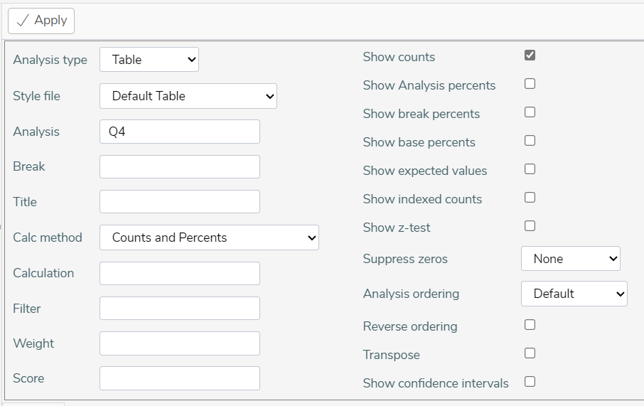
Creating a new Analysis
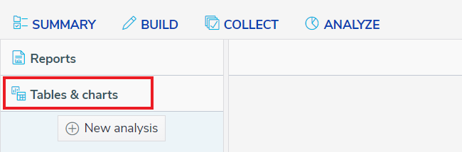
- In the Analyze section, click on the Table & charts side menu option. This displays the list of analyses that are available for the survey in Snap XMP Online and also a New Analysis button used to create a new table, chart, list or word cloud.
- Click the New Analysis button. This displays the Analysis page, containing the standard fields used to create an analysis.
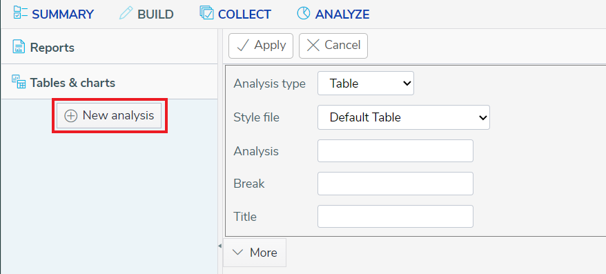
- In Analysis type, select the type of analysis, this can be Table, Chart, List or Word cloud. This updates the styles available in the Style file list to those for the selected analysis type.
- In Style file, select the style used to display the analysis.
- In Analysis, enter the question or variable. If you need more information about the variables available in the survey, click Variables in the side menu, which shows a list of the variables. Scroll down to the bottom of the list to show the buttons to go to the next or previous pages in the list.
- In Break, enter the question or variable.
- In Title, enter the title shown in the analysis display.
- Click the Apply button to create the analysis. This displays the table, chart, list or word cloud.
- You can choose to
- Download an HTML file of the analysis display.
- Modify the analysis.
- Save the analysis for future use.
- Click Save to save your changes. This opens the Save analysis dialog. Enter the analysis name then click Save. The analysis is shown in the list of analyses in the Tables & charts menu.
More options
Advanced options for the analysis are available by clicking the More button.
Options available for all analysis types
| Field | Description |
| Calc Method | There are six Calc Methods that specify the type of analysis calculation: Counts and Percents (default option) Means and Significance Means and Differences Sum and Percents Means and Percents Means and Percentage Differences |
| Calculation | Specifies the question or variable used with the calculation method. |
| Filter | Defines the subset of data to analyse given as a logical expression. |
| Weight | Defines how to alter the calculation to represent a different group of respondents. This can be the name of a variable, the name of a weight matrix and the variable to which it refers (e.g. WT1(Q10)) or a numeric value |
| Score | Name of weight matrix, calculation, or name of variable to apply |
| Analysis ordering | Defines the order in which the analysis data appears Default where items appear in the order they appear in the questionnaire Analysis Label sorts in alphabetical order by label Analysis Base sorts with the most popular reply first, based on the number of counts for each of the codes in the analysis variable. Statistics sorts by the statistics. Column Count sorts by ascending column counts. |
| Reverse Ordering | Select the check box to reverse the order chosen in Analysis ordering. |
Additional options for Tables and Charts
| Field | Description |
| Show Counts | Display the number of cases in each category. |
| Show Analysis percents | Display the percentage of cases based on the analysis. |
| Show break percents | Display the percentage of cases based on the break. |
| Show base percents | Show percentages relative to the total number of responses defined by the type of base |
| Show expected values | Display values expected if the relationship between the analysed values was consistent across the break |
| Show indexed counts | Display relative measure of individual cell values and represent values with 100 as the norm |
| Show z-test | Select the check box to display the z-test results with the confidence intervals |
| Suppress zeros | Exclude any responses where there is no reply on the Analysis, Break or Both Axis. Select ‘None’ to include all responses. |
| Transpose | Switch the axis positions of Analysis and Break in a table or chart. |
| Show confidence intervals | Select the check box to display the confidence interval results |
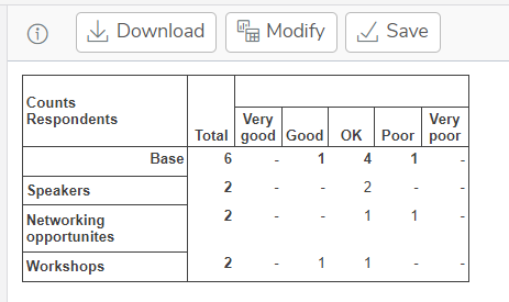
Tables
Tables show the survey data in a tabular form showing the data in rows and columns.
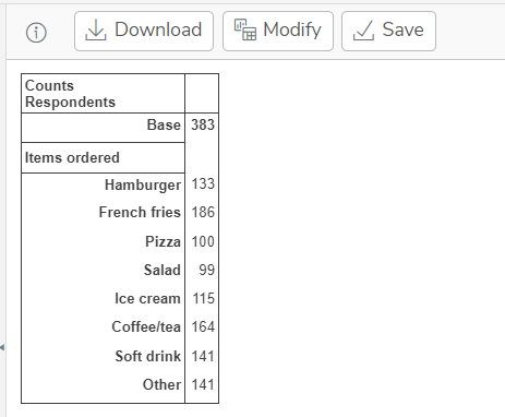
The following example shows a table definition displaying the number of customers who ordered a range of food items.
When you click the Apply button, this displays the table.
Charts
Charts show the survey data in a graphical form.
The following example shows a chart definition displaying the number of customers who ordered a range of food items.
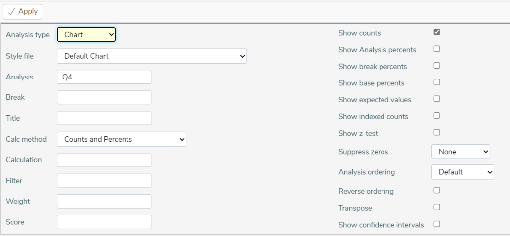
When you click the Apply button, this displays the chart.
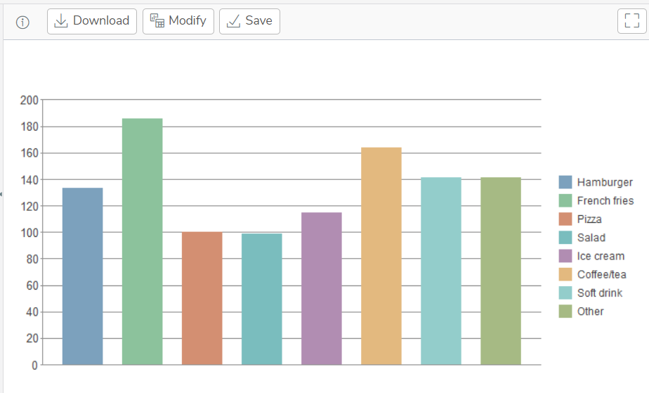
Chart style naming convention
There are a number of different chart styles supplied with Snap XMP. When using different chart styles, the style name indicates which show options you need to select.
- If the name contains Counts then select Show counts.
- If the name contains Percents you need to select one of the show percents options.
- If the name contains Transposed then select Transpose.
Please note: In a chart, you should select either counts or percents, but not both.
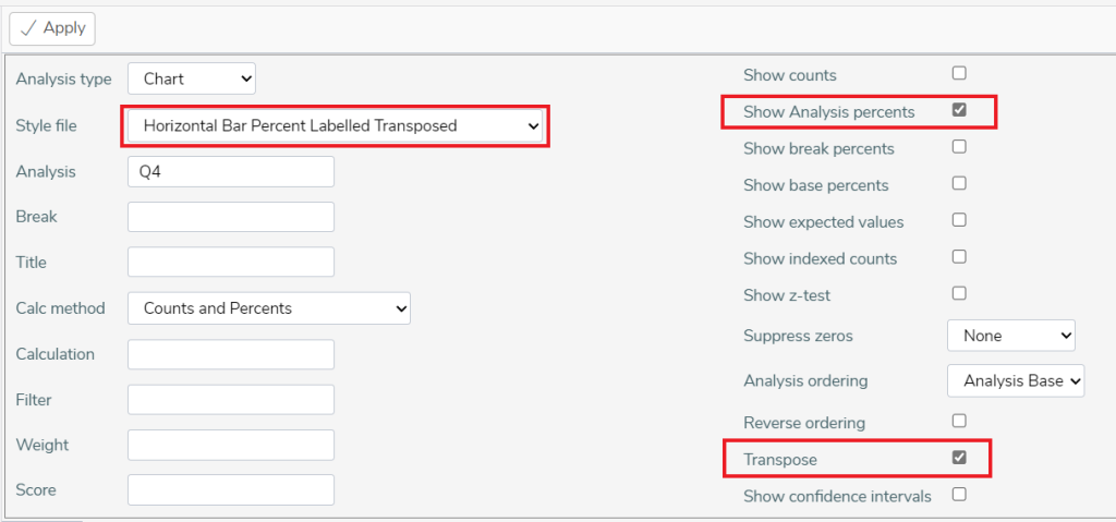
In the example, the chart style is Horizontal Bar Percent Labelled Transposed. This indicates that one of the show percents options should be selected, in this case Show Analysis percents is used. The Transpose option is also selected.
Lists
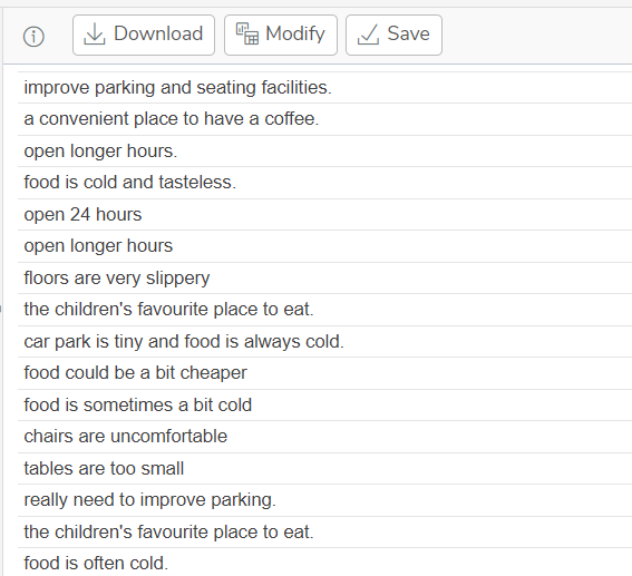
Lists are generally used to display comments or free format text responses. The following example shows a list analysis for a question asking for customers’ comments.
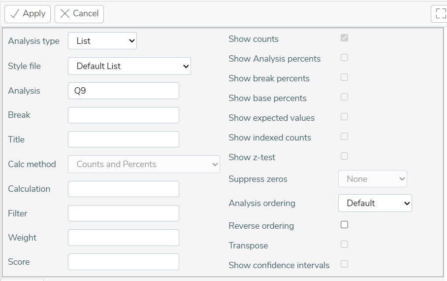
When you click the Apply button, this displays the list.
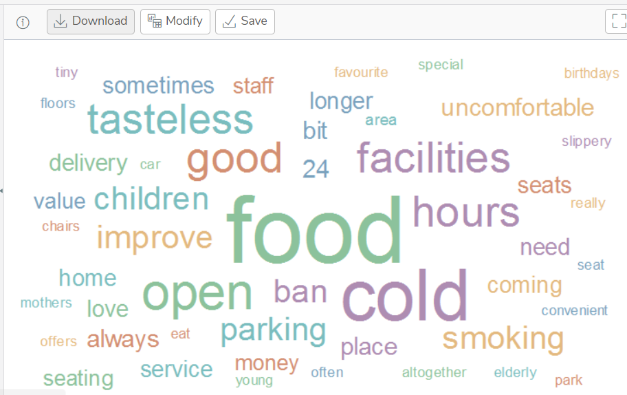
Word Clouds
Word Clouds are used to show important or regularly occurring words in the comments or free format text responses. The more often a word appears in the comments then the larger the word is displayed in the Word Cloud.
The following example shows a word cloud analysis showing words from a question asking for customers’ comments.
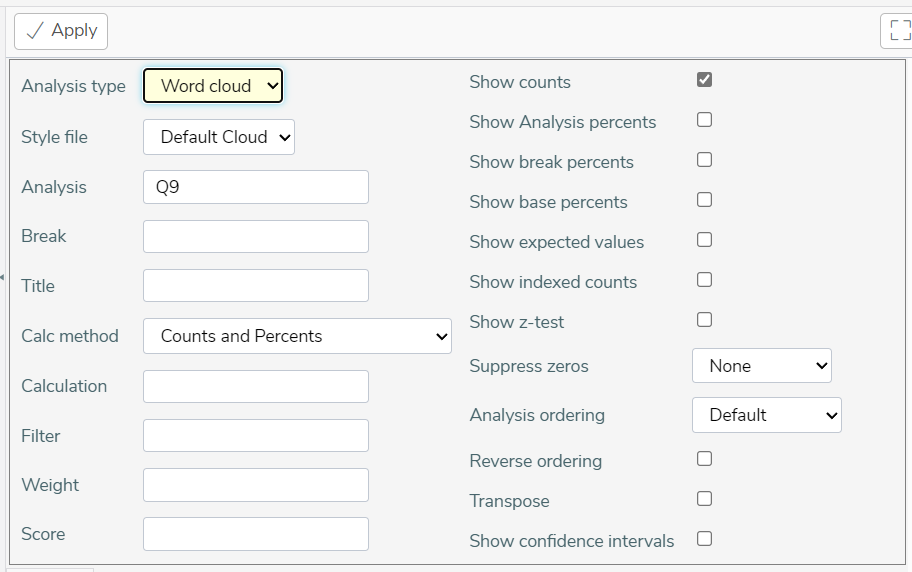
When you click the Apply button, this displays the word cloud.