Create a chart of positive responses to rating scale questions
Rating scale questions ask the participant to select a rating from a range of responses. These responses usually range from a negative to a positive rating or vice versa and often include 5 or more points. An analysis of the results can be hard to interpret if all the categories are charted. The responses can be grouped into a reduced number of categories such as positive, neutral and negative to simplify the chart and make it easier to interpret at a glance. This can be further simplified to show only positive or negative responses to the rating scale question.
This worksheet shows how to:
- categorise responses as positive, neutral or negative
- create a horizontal bar chart using the new categories
- exclude the neutral and negative categories, leaving only the positive category
Step 1: Categorise responses as positive, neutral or negative
In this example, participants rate aspects of service on a 5 point scale ranging from Very Good to Very Poor. Derived Variables are used to sort Very Good and Good responses into a new Positive category, OK responses into a new Neutral category, and Poor and Very Poor responses into a new Negative category.
- On the Snap XMP Desktop toolbar, click Variables
 to open the Variables Window.
 - Click New Variable
 to add a new variable.
 - Specify the Variable details as follows:
- Name: VQ6a
- Label: Quality of product (this will be displayed on the chart)
- Type: Derived (the variable will derive its data from other existing variables)
- Response: Single (each participant will only fall into one of the new codes)
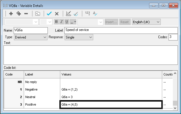
- Create the derived values for the Negative, Neutral and Positive ratings. For example, the Negative category is given by points 1 and 2 on the scale (Very Poor and Poor) and the Value is Q6a=(1,2).
-
Click Save
 to save the variable and close the Variable Details window.
- On the Variables Window toolbar, click Clone Variable to copy the derived variable you have just created. Change Q6a to Q6b throughout, and update the label.
-
Click Save
 .
.
- Repeat for the other questions in the grid.
Step 2: Create a horizontal bar chart using the new categories
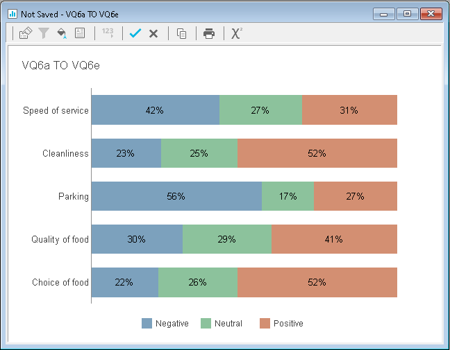
Now you can use the new derived variables to create a stacked bar chart of positive, neutral, and negative results.
- On the Snap XMP Desktop toolbar, click Analysis Chart
 to create a new chart.
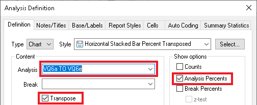
 - In the Style list, select Horizontal Stacked Bar Percent Transposed.
- In the Analysis field, enter the derived variables.
- Select the options Analysis Percents and Transpose.
- Click Apply. Your chart shows the three derived categories.
-
Click Save
 to save the chart.
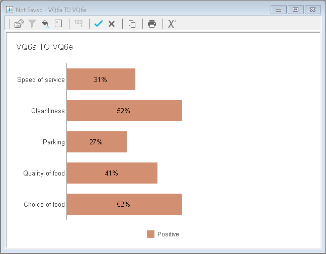
Step 3: Show only the positive ratings
To create a chart showing only the positive responses, the negative and neutral values need to be excluded. You could also exclude the positive and neutral values to create a negative chart. This is achieved using the Chart Designer.
- In the Analysis Chart window, double-click the Negative bar to open the Chart Designer. It will open with Series selected on the left-hand side.
- Select Negative in the Series list and select Exclude Series in the options.
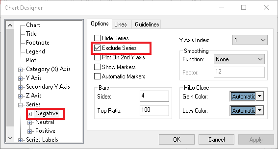
- Select Neutral in the Series list and select Exclude Series in the options.
- Click OK to close the Chart Designer. Your chart now shows only the positive ratings.