Changing the colour of the default Summary Reports
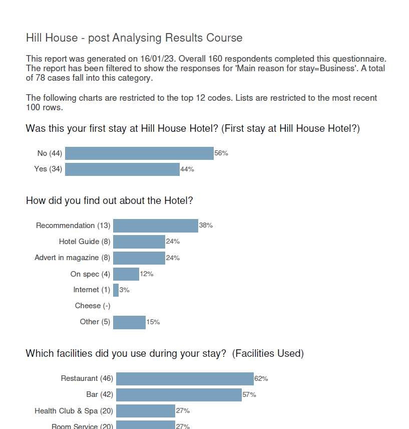
The charts within the Summary and Summary Dashboard reports use a Chart Style that is saved within the Styles folder of Snap XMP Desktop.
In order to edit the format of the charts within these 2 reports, the Horizontal Bar Summary Report chart style needs to be edited.
Steps
- Create a chart using the Horizontal Bar Summary Report style
- Make the required styling edits to the chart
- Save the chart style, replacing the original
- Run the reports to check the are reports are as expected
1. Create a chart using the Horizontal Bar Summary Report style
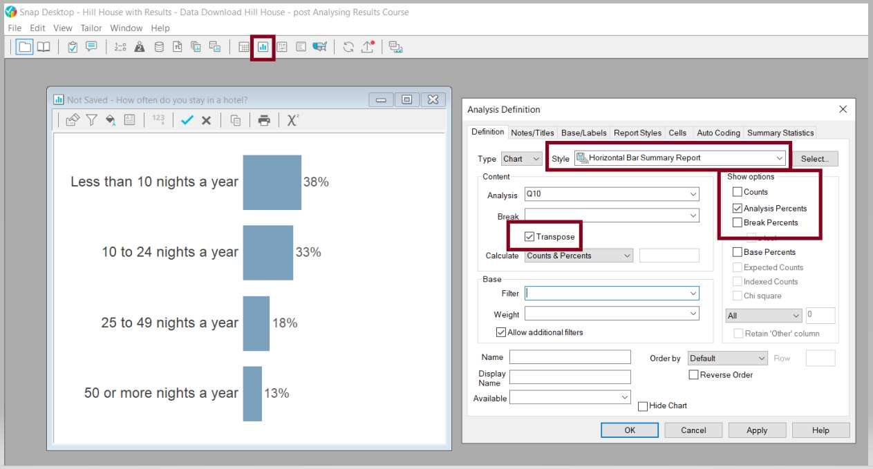
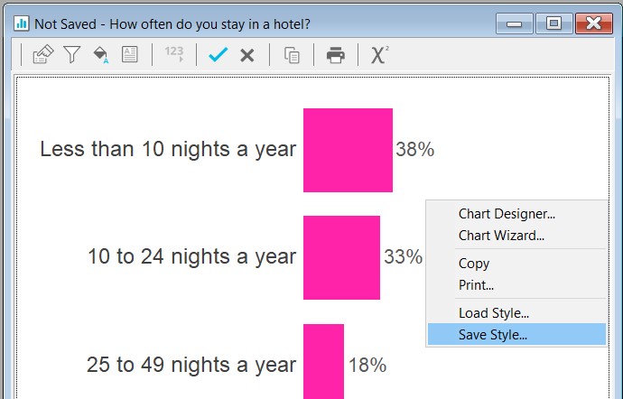
2. Make the required styling edits to the chart
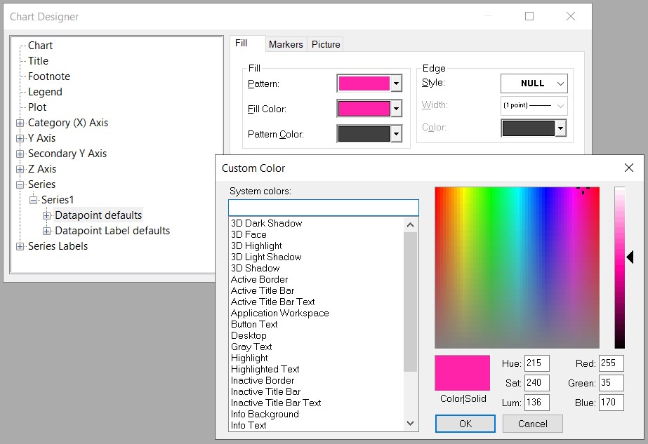
Double click on a blue bar, open the Series1 folder and select Datapoint Defaults
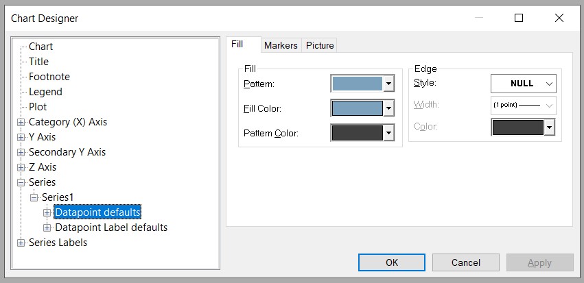
Edit the Fill Color, using the RGB (Red / Green / Blue).
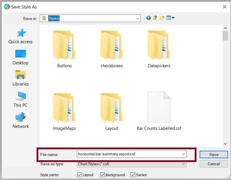
3. Save the chart style, replacing the original
Right click to Save Style
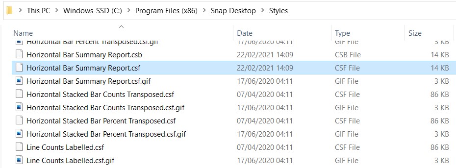
Save the chart style (using the original name of Horizontal Bar Summary Report) in the Styles folder of Snap XMP Desktop.

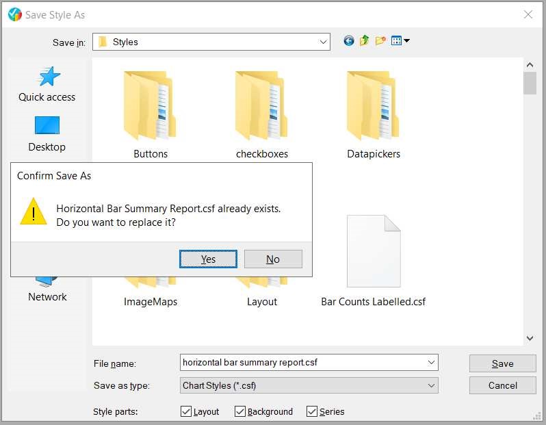
This will replace the original file.
As a backup, you might wish to store a copy of the original file elsewhere, should you wish to go back to the original style at a later date.
4. Run the reports to check the are reports are as expected
