Button style questions
These are styles of existing questions that use buttons to select an answer choice rather than checkboxes. They are included in the Blank Template and Blank Single Edition Template in Snap XMP.
There are a number of questions that are available with buttons:
- Single Choice – Buttons
- Multi Choice – Buttons
- Grid – Buttons
- Semantic Scale – Buttons
- Carousel – Buttons
- Tab Headers – Buttons
Single Choice – Buttons
- Press Enter to start a new question after the currently selected question. By default, this is a single response question and the question style is Single Choice on the toolbar.
- Select Single Choice – Buttons in the Style selection drop-down.
- Enter the question text in the “Click here for text” placeholder.
- Enter the answer options in the “Code Label” placeholders.
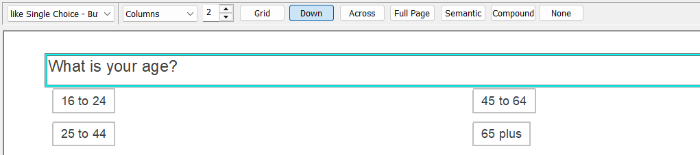
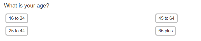
The questionnaire displays the answer options as buttons in the interview.
Multi Choice – Buttons
- Press Enter to start a new question after the currently selected question. By default, this is a single response question and the question style is Single Choice on the toolbar.
- Select Multi Choice – Buttons in the Style selection drop-down.
- Enter the question text in the “Click here for text” placeholder.
- Enter the answer options in the “Code Label” placeholders.
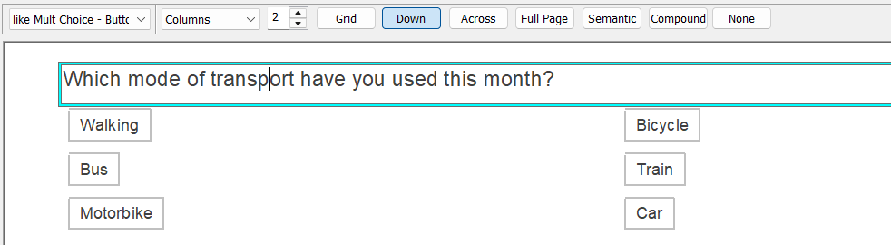
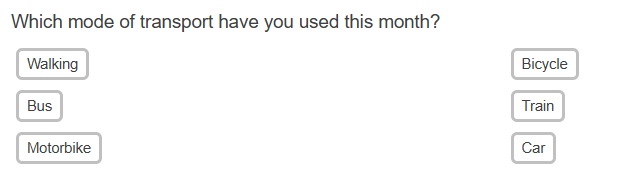
The questionnaire displays the answer options as buttons in the interview.
Grid – Buttons
- Press Enter to start a new question after the currently selected question. By default, this is a single response question and the question style is Single Choice on the toolbar.
- Select Grid First – Buttons in the Style selection drop-down.
- Enter the question text in the “Click here for text” placeholder.
- Enter the grid row text in the “Grid Label” placeholders.
- Enter the answer options in the “Code Label” placeholders.
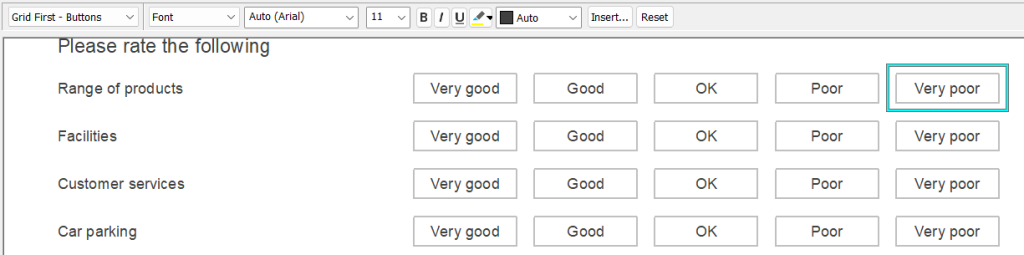
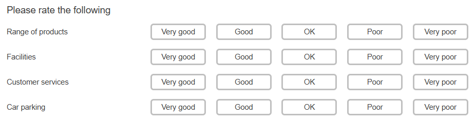
The questionnaire displays the answer options as buttons in the interview.
Semantic Scale – Buttons
- Press Enter to start a new question after the currently selected question. By default, this is a single response question and the question style is Single Choice on the toolbar.
- Select Semantic Scale First – Buttons in the Style selection drop-down.
- Enter the question text in the “Click here for text” placeholder.
- Enter the answer options at each end of the scale in the “Code Label” placeholders.
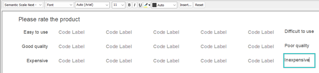
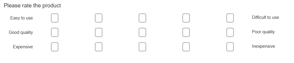
The questionnaire displays the answer options as buttons in the interview.
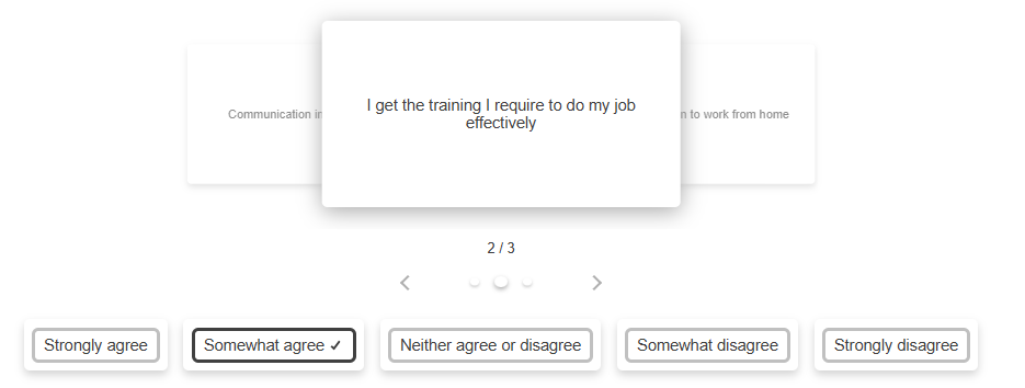
Carousel – Buttons
- Press Enter to start a new question after the currently selected question. By default, this is a single response question and the question style is Single Choice on the toolbar.
- Select Carousel First – Buttons in the Style selection drop-down.
- Enter the question text in the “Click here for text” placeholder.
- Enter the answer options in the “Code Label” placeholders.
- Enter the grid row text in the “Grid Label” placeholders. This text appears on the carousel cards.
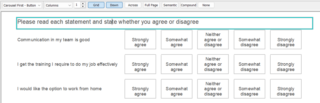
The questionnaire displays the answer options as buttons in the interview.
Tab Headers – Buttons
- Press Enter to start a new question after the currently selected question. By default, this is a single response question and the question style is Single Choice on the toolbar.
- Select Tab Headers – Buttons in the Style selection drop-down.
- Enter the question text in the “Click here for text” placeholder.
- Enter the answer options in the “Code Label” placeholders. The code labels are used as the tab header descriptions.
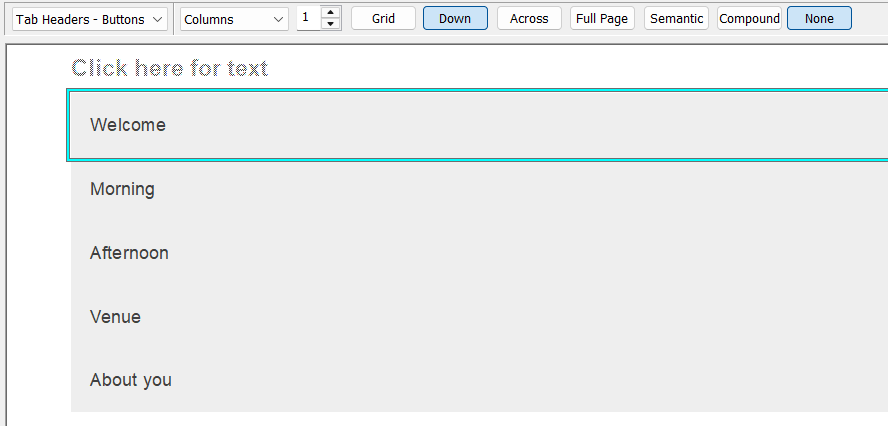
The questionnaire displays the tab options as buttons in the interview.

Customise the buttons
You can customise the buttons by changing the colour, changing the border style, including a box image and showing the code labels with no columns.