Analyses of mean values
Tables, charts and Maps of mean values can be built. Maps can only be used to display a single row or column of data.
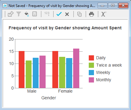
The example describes how to display a table using the data in the Crocodile Rock Cafe survey showing the average amount spent (Q5) broken down by frequency of visit (Q2) and gender of the respondent (Q12).
-
Click
 to open the Analysis Definition dialog to build a table.
- Specify the Analysis variable for the table or chart as Q2 (frequency of visit).
- Specify the Break variable for the table or chart as Q12 (gender).
- Set Calculate to either Means & Differences or Means & Significances. Only the means are required for this table; differences or significances will not be shown, as only the Means option is ticked.
- Specify the Calculate variable as Q5 (amount spent).
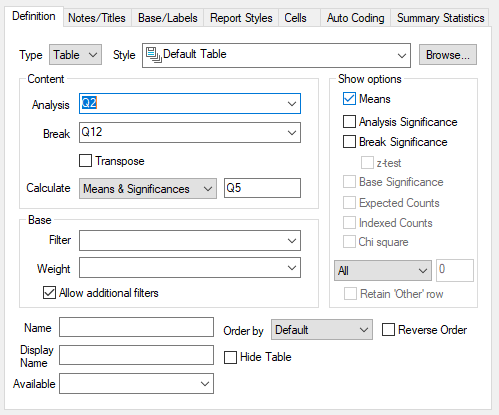
- Click OK to build the table.
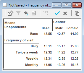
Each cell in the table shows the average amount spent. For example, the average amount spent by males who visit the restaurant daily is 15.17.
To convert this table to a chart format
-
Click on
 in the table window.
- Change the form from Table to Chart.
- Click Browse by the Style field, and select the style Bar Counts from the drop-down list.
- Click OK to build the chart.