Gap Analysis: Compare results from satisfaction and importance questions
What is gap analysis?
Gap analysis shows the difference between how important attributes or services are to your respondents and how satisfied they are with those attributes or services. It is a useful way of comparing the results from your satisfaction and importance questions and can be used as a tool for interpretation.
By comparing importance and satisfaction scores in your chart you can use gap analysis to identify priorities for improvement. Gap analysis results indicate that if the satisfaction measure is less than the importance measure the business may not be meeting expectations.
Interpreting the gap analysis chart
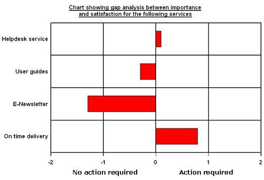
In the example chart below a 5-point scale question was used in the Course Evaluation sample survey for both importance and satisfaction. The ratings are from 1 to 5, where 1= totally dissatisfied to 5= totally satisfied and 1= not at all important to 5 = extremely important.
The gap analysis chart
The chart plots how important various aspects of service are to customers, compared with how satisfied customers actually are with that service. The bars indicate the gap which is the mean score for the satisfaction rating subtracted from the mean score for the importance rating.
Interpretation
The interpretation of the results is as follows:
If the mean score of a service is positive (above zero) then respondents rated the service very important, but they are not satisfied with the service. In this instance, action is required.
If the mean score of a service is negative (below zero) then respondents rated this service relatively unimportant, but are very satisfied with the service. In this instance no action is required.
The closer the gap is to zero the better balance there is between importance and satisfaction.
Below is an interpretation of the findings in the example chart above.
HelpDesk Service – has a small positive gap therefore, respondents rated Helpdesk as a relatively important feature compared to their low satisfaction rating. This could be seen as an area for improvement.
User Guides – has a small negative gap therefore customers have rated this with higher satisfaction than importance. More time could therefore be spent improving other products.
E-Newsletter – has a large negative gap therefore respondents have given this service high satisfaction scores when answering this question, but they do not think this is an important feature. The company needs to concentrate on improving other services and products and leave the E-newsletter as low priority.
On time delivery – has a large positive gap therefore respondents think this service is very important, but their satisfaction of this service is low therefore it is a high priority for improvement.
Setting up the gap analysis
The following instructions show how to create a gap analysis chart. This gap analysis can be found in the Course Evaluation survey provided with Snap XMP Desktop. The Gap Analysis chart style is also provided with Snap XMP Desktop
To set up the gap analysis chart you will need the following:
- create a number of derived variables
- tailor the chart
- create a chart style
Open the Course Evaluation survey and familiarise yourself with the importance (Q5a to Q5d) and satisfaction (Q6a to Q6d) questions.
If you open the Variables screen, you will notice that the derived variables to calculate the scores have already been created for you in V1.1, V1.2, V1.3, and V1.4. You can open these, by double clicking on them, to see how they have been set up. However, if you wish to create the derived variables to follow this worksheet we will name them V2.1, V2.2, V2.3 and V2.4 in the following steps.
Step 1: Create the derived variables
Create the derived variables. The derived variables will subtract satisfaction scores from importance scores for each attribute or service rated, for example Course content satisfaction scores will be subtracted from Course content importance scores. Each rated attribute will have to be set up as an individual derived variable.
- Open the survey and click
 to display the Variables window.
 - Click
 to add a new variable.
 - Setup the new Variable with the following details:
- Name: V2.1
- Label: Course content (The label is a full description of the variable that will appear in the Data window and on all analysis reports.)
- Type: Derived (The variable will derive its data from other existing variables.)
- Response: Quantity
- Click inside the Values area, in the same row as Valid. Type: Q6a – Q5a (Q6a is the satisfaction question and Q5a is the importance question.)
- Click
 to save the derived variable. You will see the saved derived variable (V2.1) in the variable window.
 - Repeat the steps 2 to 5 above to create 3 more derived variables with the following details:
- Name: V2.2
- Label: Instructor
- Type: Derived
- Response: Quantity
- Value: Q6b – Q5b
- Name: V2.3
- Label: User guides
- Type: Derived
- Response: Quantity
- Value: Q6c – Q5c
- Name: V2.4
- Label: Value for money
- Type: Derived
- Response: Quantity
- Value: Q6d – Q5d
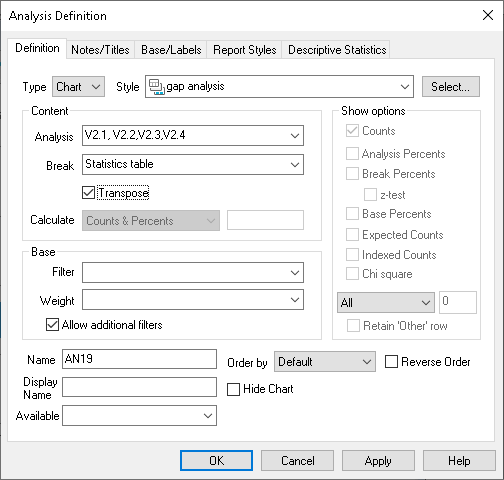
Step 2: Create the gap analysis chart
The next stage is to create a chart to display the results of the derived variables.
- Click Analysis Chart
 to display the Analysis Definition dialog for a chart.
 - Select the chart style Gap Analysis from the drop down list.
- Type the names of the derived variables into the Analysis field, for example V2.1, V2.2, V2.3, V2.4.
- Type stats in the Break field (or select Statistics table from the Break drop-down list).
- Check the Transpose box.
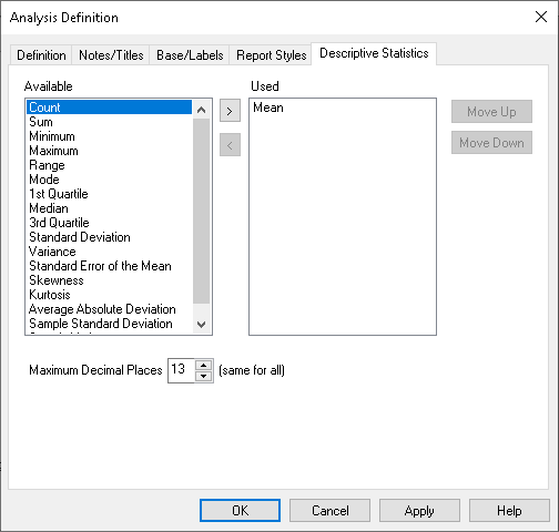
- Click the Descriptive Statistics tab to select which statistics will be used.
- Select all of the items in the Used column on the right-hand side.
- Click on the left arrow
 button.
 - Select Mean from the list in the Available column and click on the right arrow
 button.
- Click Apply to see the chart.
- To change the title shown on the chart, click the Notes/Title tab of the Analysis Definition dialog and type in a title in the Title box.
- Click Apply to see the chart.
- To add the text at the base of the chart (Needs Attention and Needs No Attention is this example), click into the Notes area of the Notes/Titles tab and type the text you require and click Apply.
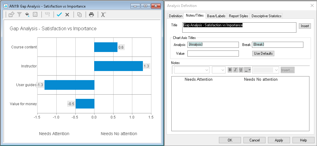
Note: You may need to format the text in the Notes area so that it lines up appropriately under each side of the chart. Adding extra spaces will add a gap between the text.
- Click OK to close the Analysis Definition dialog.
- Click
 to save the chart.
 - To save this chart style right click anywhere on the chart and select Save Style.
- Browse to the Styles folder within the Snap folder and give the new style a name (e.g. Gap Analysis New.csf).
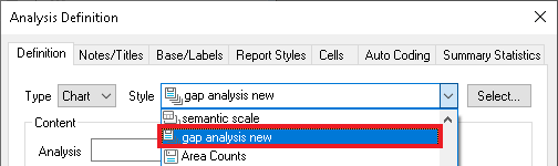
The new style is available to select in the Style dropdown list in the Analysis Definition dialog.
If there is a topic you would like a tutorial on, email to snapideas@snapsurveys.com