Creating a simple chart
Charts play an important part in analysis and reporting. They show the response data in a visual format that helps individuals understand the responses to the questions. The chart layouts available include bar charts, pie charts, line graphs and area charts.
Chart styles
When creating an analysis chart, you need to select the type or style of the chart. Snap XMP provides a large number of pre-defined chart styles. These styles define the layout and colors used to display the chart. Some styles define only the color scheme which is useful when you need a specific set of colors, such as for your organisation’s branding. The pre-defined styles can be edited using the Chart Designer.
Style naming convention
The chart styles that are supplied with Snap XMP Desktop follow a naming convention that can be used to help set up the analysis definition.
Chart styles that contain a layout and colors start with the chart name, such as, Bar, Horizontal Bar, Line and Pie.
If the chart style name contains the word:
- Counts then select Counts in the Show Options section
- Percent then select one of the percent options in the Show Options section
- Transposed then select Transpose otherwise clear Transpose
For example, for the chart style Horizontal Bar Percent Transposed, select the one of the percent options, such as Analysis Percents, and select Transpose.
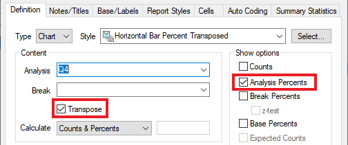
Chart styles that contain only a color scheme start with the word Color and are followed by a description of the color scheme. For example, Color – 5 point Green to Red Stacked.
Create a simple bar chart
When an analysis, including a chart, is created, two windows are shown to help define the analysis:
- Analysis Definition window used to define what response data is shown, the chart style and default text used in the chart.
- Analysis Display window used to define how the chart is displayed.
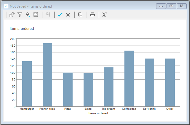
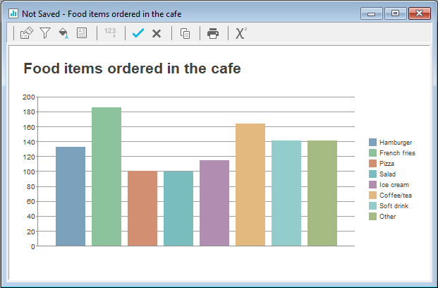
Usually, the first step is to decide which type of chart you are going to use, although the chart style can be changed at any time. In this example, the chart style selected is Bar Counts. This is a bar chart where the bars show the number of respondents that selected each response.
Instructions
- In Snap XMP Desktop, open the survey.
- Click Analysis Chart
 on the Snap XMP Desktop toolbar. This opens the Analysis Definition window where you can create a new chart. This also opens the Analysis Display window which is blank for a new chart before the chart style is selected.
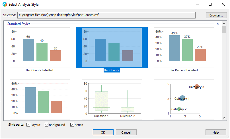
 - In the Analysis Definition window, click the Select button. This opens the Select Analysis Style dialog. A thumbnail image is shown for each predefined chart style, helping you choose the style you want. Click on the image to select the chart style. The style selected in the example is Bar Counts. Click OK to select the style.
- The next step is to define the response data that is shown in the chart. A simple example of a bar chart is to show the responses to a single question. In Analysis, enter Q4, which is a question asking about the items ordered in a café.
- Click Apply to show the chart display in the Analysis Display window.
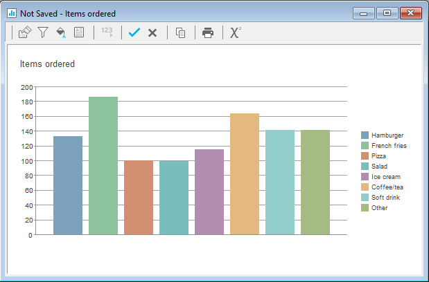
- The bar chart shows all the responses to the question Q4 with each bar showing the number of respondents who ordered each item. The legend shows which color corresponds to each question response. The chart title defaults to the Q4 label and the bars are arranged in the order each choice is asked in the question.
Some default settings for an analysis are set up in Analysis Tailoring and these defaults may vary in your organisation. This is opened by clicking Tailor | Analysis.
Resizing the chart and chart elements
Resize the chart by hovering over the move the cursor to any edge or corner of the window until a double-headed arrow appears. When this arrow appears, click and drag to make the window larger or smaller. The chart resizes to fill the chart plot space available. You can see how your chart will look in different display sizes.
Some chart elements can be resized by clicking on the chart element to select it. Hover the cursor over the black selection markers until a double-headed arrow appears. When this arrow appears, click and drag to make the element larger or smaller.
Drag and Drop
Some items in the chart can be moved using drag and drop. This includes the title, legend, chart plot, footnote and datapoint labels.
- Click the item in the chart display. The area is shown with small black squares around the selected area.
- Click in the selected area and drag to the new position. The chart display changes around the repositioned item.
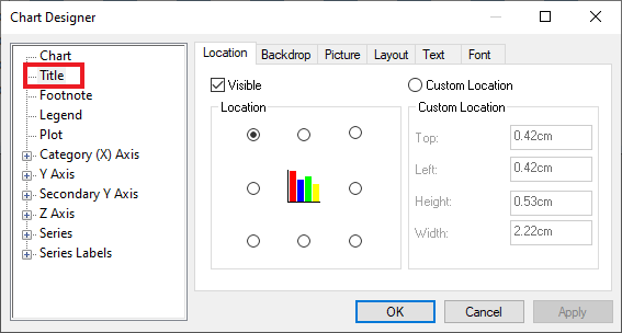
Opening the chart designer
The Chart designer helps you customise the style of your chart. Open the Chart Designer by clicking the Edit Style button ![]() in the toolbar of the Analysis Display window.
in the toolbar of the Analysis Display window.
The Chart Designer shows the chart elements on the left-hand panel in the Chart Designer. Selecting a chart element displays tabs that allow you to change different aspects of that element. Some of the chart elements have sub-elements that can be accessed by clicking on the ![]() symbol.
symbol.
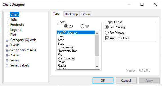
You may want to change an item but not know what it is called. In this case, double-click on the item in the chart. The Chart Designer opens with the item selected.
Saving or cancelling changes
- As you make changes to the chart elements in the Chart Designer, click on Apply to see the effect they make. Once you have clicked Apply the Cancel button will not reset the changes.
- To abandon your changes, as long as you have not clicked on Apply, click on Cancel.
- To confirm your changes, click on OK. These updates are made to the Analysis Display window but are not permanently saved as part of the analysis chart.
-
To save the changes permanently go to the Analysis Display Window. If you wish to cancel all the changes made, click the Cancel
 icon on the toolbar. To save the changes, click the Save
 icon on the toolbar.
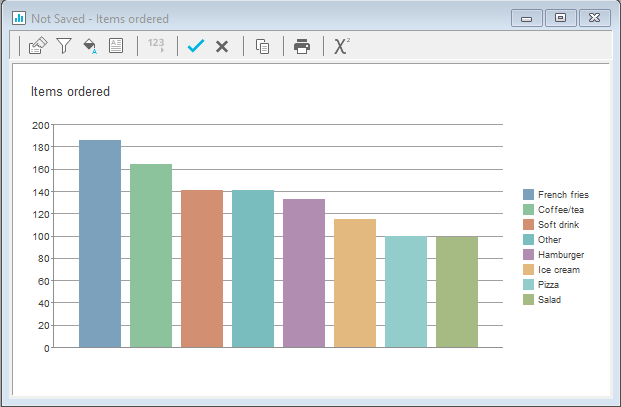
Transpose to show labels on axis not legend
In the Bar chart shown you can change the legend so that the labels are shown on the axis underneath.
- In the Analysis Definition window, select Transpose. This removes the legend, and the labels show underneath each bar.
Excluding No replies
Not all respondents complete every question when they submit a response to the survey. Often, in the analysis, the responses containing, no reply, are not relevant and you do not want to see them in the chart.
Note: The default setting to show or hide No reply responses is set in the analysis tailoring. The analysis tailoring dialog opens from the Tailor | Analysis menu. Your organisation may already exclude no reply responses.
To exclude the no replies:
- In the Analysis Definition window, click the Base/Labels tab.
- In the No reply drop down, select Exclude.
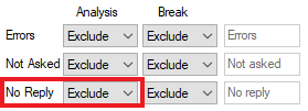
- Click Apply. Check that there are no replies responses shown.
-
In the Analysis Display window, click Save
 to save the changes to the chart.
Ordering
You can order the bars in several ways
- Default. This is the order that the choices appear in a question.
- Analysis Label. This is the alphabetical order of the choice labels in a question.
- Analysis Base orders by the number or percent of responses in descending order.
- Column counts
- (Score) orders by any statistics on the table e.g. mean
- If the Analysis Definition window is not open, click on the Properties icon on the Analysis Display window.
- In the Analysis Definition window, select Analysis Base in the Order by list.
- Selecting Reverse order reverses the order of the items.
In addition, customised ordering is available in the Chart Designer.
- Double-click on a bar to open the Chart Designer.
- Click on Series above the selected bar.
- Click on the Order tab.
- Click the Up and Down buttons to order the bars, as required.
- Click Apply to update the chart display.
Changing the chart title
You can customise the chart title by
- changing the font, font size, font style and font color
- changing the text
- changing the text alignment
- changing the title orientation
- changing the location
- changing the background color and pattern
- changing the title frame style and shadow effect
- adding a background image or replacing the title text with a logo or image
Double-clicking on the legend opens the Chart Designer.
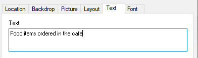
- Click the Text tab and enter a new title for the chart. Click Apply to update the chart.
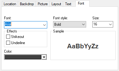
- Click the Font tab and increase the font size and make the text bold. Click Apply to update the chart.
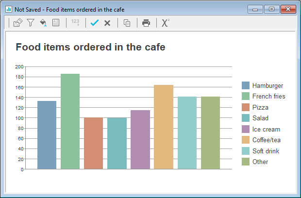
The chart title is now more noticeable with a clearer description.
Changing the chart legend
You can customise the legend by
- changing the location
- changing the background color and pattern
- adding a background image or replacing the title text with a logo or image
- changing the font, font size, font style and font color
Double-clicking on the legend opens the Chart Designer.
- To make the legend text easier to read, click the Font tab and increase the font size. Click Apply to update the chart.
Changing bar colours
The chart style chosen determines whether the bars in a series are different colors or all the same color.
- When you click on the bar that needs changing, this selects all the bars in the series with the same color. This shows you which bars will be updated.
- Double-click on the bar to open the Chart Designer at the series (bar color) settings.
- Click the plus + to expand the bar settings and select Datapoint defaults.
- In the Fill tab, select the Pattern, Fill color or Pattern color required.
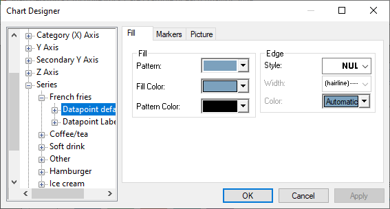
- Click Apply to update the chart display.