Creating reports that include automatic text
Smart Reports can be re-run using the latest data to produce an up-to-date report. You can easily re-run reports and know that once you have set up the report the way you like it, it will be reproduced like that every time you run it.
In Snap XMP, reports are built up using instructions. These instructions allow you to add text, graphics, and analyses to a report. When the report is run, the current response data is inserted into the analyses and text information.
You can insert references in your instructions. When the report is run these references are replaced with data from the survey or responses.
In Snap XMP you can insert table cell references. If you create a table, you can use references to the row labels, column labels and the table cells in the report text, notes on analyses or even in another table. This means that you can use any data that is in the table in your report, and it will automatically use the latest data.
In Snap XMP Desktop, you can create a ranked table and order the columns from highest to lowest. This means that you can automatically place the highest and lowest values in your report without needing to edit them.
This tutorial explains how to create a simple report showing satisfaction rankings. The report uses data from analyses in the report text and shows how to use ranked tables to headline important points. For example, you can automatically include the aspects your customers are least satisfied with.
This tutorial uses the Course Evaluation survey which is distributed as a sample survey with Snap XMP Desktop.
How table cell references work
Cell references are a means of inserting automatically updated data in a report (or in the notes for an analysis). A cell reference is the position of the data in the specified table.
The cell referred to can be:
- A row label (describe by tablename RN label e.g., AN1 R1 label
- A column label (describe by tablename CN label e.g., AN1 C1 label)
- A data cell described by its row and column number (describe by tablename RNCN e.g., AN1 R1C1)
- A statistic value described by its row and statistic number (where its statistic number is its position in the list of statistics, S1 being the top, given by tablename RNSN e.g., AN1 R1S1)
where N is replaced by the row or column number.
Once you have inserted the cell reference into the report, any filters applied to the whole report are applied to the table containing the referenced cell.
You can use any analysis as the basis for the reference. For example, if you wish to insert a reference to data in a chart, view the chart as a table to find the cell reference then redisplay it as a chart.
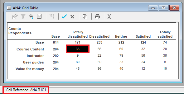
You can find out what the code for a given cell is by putting the cursor on it or clicking it. The cell reference information will be displayed in the status bar.
You can also find the cell reference details by double-clicking the cell and checking the information in the Override Analysis Value dialog.
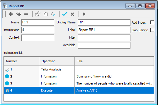
Step 1: Deciding what goes into your report
When you create a Smart Report, it is important to plan your report. The simple report used in this worksheet will include:
- a title
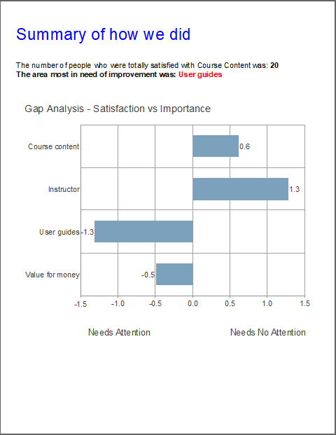
- a sentence giving the number of people totally satisfied with course content (from the table AN4)
- a sentence giving the topic that most needs improvement (using ordered gap analysis)
- the gap analysis chart AN15
Step 2: Creating the instructions
The report will contain a title, an information line, and an analysis.
Add the title
- Click Reports
 on the Snap XMP Desktop toolbar to open the Reports window.
 -
Click New Report
 to create a new report. This is created with a Tailor Analysis instruction.
-
In the Report details, click New Instruction
 then select Information from the menu to add a new Information instruction.
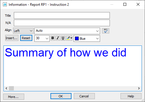
- In the Information window, enter the title for your report in the text pane. Leave the Title field blank (this is the title of the Instruction). Style your title text by selecting text and using the format buttons.
- Click OK to save the instruction.
Create the satisfaction reference
- Click Analyses
 on the Snap XMP Desktop toolbar to open the Analyses window.
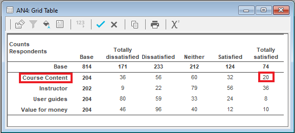
 - Open the grid table AN4 to check which cells you need. The report uses the label of the first row, and the value in the fifth column of the first row.
- Close the table and the Analyses windows.
- Return to your report and add another Information instruction.
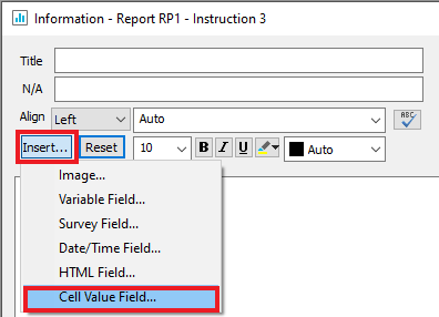
- Enter the text “The number of people who were totally satisfied with the ” then click the Insert button and select Cell Value Field from the menu. This opens the New Cell Value Field dialog.
- Enter the reference AN4 R1label in the box and click OK. This will put the contents of the label for row 1 of analysis AN4 in your report. When it appears in the report, it will be in curly braces. Note that the Base row is row 0.
- Add the text ” was: ” and then insert another cell value of AN4 R1C5. Style the text and references.
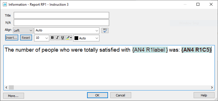
- Click OK to save the Information instruction.
Insert the gap analysis table in your report
-
In the Report details, click New Instruction
 then select Execute from the menu to add a new Execute instruction.
- In the Execute dialog, select AN15 (the Gap Analysis chart) from the Execute list.
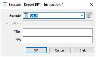
- Click OK to add the Execute instruction to the report.
-
Click Save
 to save the report.
Step 3: Testing your report
It is important to check that your report looks the way you want it and is picking up the correct data.
-
Click the Execute
 button on the Report toolbar. This opens the Report Execution dialog with options to Check, Preview or run the report.
- It is a good idea to check and preview your report on screen before sending it to a printer. Click the Printer button to select to print to a pdf file or to paper.
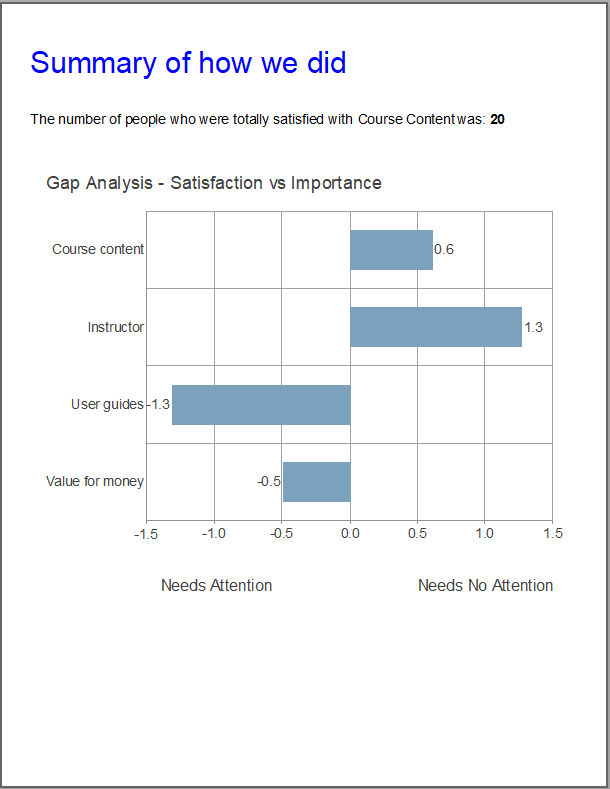
- Click OK to close the printer window and then click OK to run the report. Your report will look something like this.
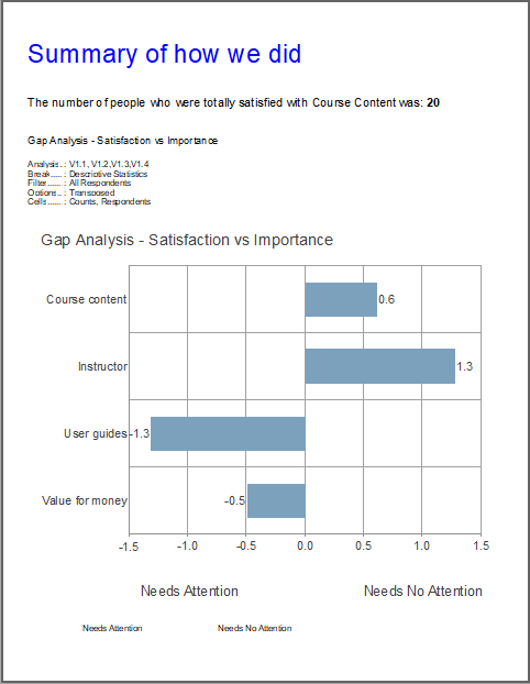
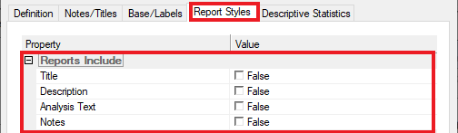
- Check that the data that appears in the report is from the correct table cell. The chart includes the description, title and notes. You can stop those appearing by changing the Analysis Definition.
- Click Analyses
 on the Snap XMP Desktop toolbar to open the Analyses window.
 -
Open the chart AN15 and select Properties
 to open the Analysis Definition.
- Select the Report Styles tab and clear the Reports Include options: Description, Notes, Analysis Text, and Title.
- Click OK to save your changes.
-
Click Save
 to save the analysis
-
Click Execute
 on the Report toolbar to and run the report again. Your report will now look something like this.
Step 4: Putting in the best and worst values
You can put the highest and lowest values in a report automatically. This step shows you how to put the area needing the most improvement in the summary line by using a sorted table.
Create a sorted table
- Select AN15 in the Analyses window.
-
Click Clone Analysis
 to make a copy of it.
- In the Analysis Definition window showing the cloned analysis, change the Type to Table and the Order to Mean. This sorts the columns in order by the mean value, so the highest value will always appear in the first column and the lowest in the last.
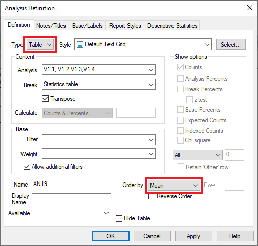
- Click OK to display the table.
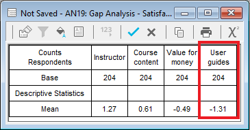
- The lowest value in this table is in the fourth column. You can reference the column label to show which area is most in need of improvement.
-
Click Save
 to save the table.
Add the area needing most improvement to the report
- Open your report.
- Open the second Information instruction (instruction 3).
- Add the text “The area most in need of improvement is :”.
- Insert the cell reference AN19 C4label to insert the label of the fourth column.
- Click OK to save the changes.
-
Click Execute
 to save changes and run the report again. Your report will now look something like this:
When more responses come in, you can run the report again, and it will be updated with the new data. If the outcomes are different, that will automatically be carried through to the report.
If there is a topic you would like a tutorial on, email to snapideas@snapsurveys.com