Putting counts and percentages on a bar chart
Bar charts normally display one value per bar. You can choose whether this is:
- the count (number of respondents who chose that response)
- the percentage (number of respondents as a percentage of the total).
This tutorial explains how to create a bar chart that shows both the counts and the percentage values on a single chart:
Note: To show either counts or percents on a bar chart, use the preconfigured chart styles supplied with Snap XMP Desktop, such as, Bar Counts Labelled or Bar percent labelled.
Bar chart styles
Bar charts are different from tables because you can only display one value for each bar (the height of the bar on the scale).
You can represent counts and percentage values together in a table.

For a bar chart, the height of the bar must be either the counts or the percentage. If you want to display both the counts and the percentage value, you need to pass in the counts and use the Chart Designer to calculate the percentages from the counts.
The following examples use the Bar Counts style to display an item in the Analysis field.
If you enter a term in the Analysis field, the bar chart styles identify the separate items by colour and use a key to tell you which bar is associated with which question or question code.
If you enter a term in the Break field, the bar chart styles identify the separate item by labelling the X-axis below the bars. (This also happens if you enter the term in the Analysis field and check Transpose.)
You can enter analysis terms in both the Analysis and the Break fields (as for a cross-tabulation) and see the results displayed as a bar chart.
If you are only using a single term, you can choose whether to have your bars identified by a colour key or labelled.
If you want your chart to give the exact values for each bar, you can display them on the chart.
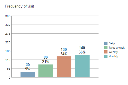
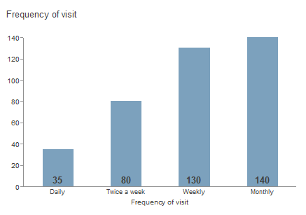
Bar chart of counts using the Bar Counts Labelled style. The term is in the Analysis field and the Transpose box is checked.
Bar chart percentages
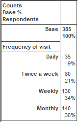
When you display a percentage, you need to know what it is a percentage of. The base percents shown in the table are calculated as the percentage of all the respondents that gave that response.
If you are charting a single-response question, the total number of responses is probably the same as the number of respondents. If you are charting a multi-response question, there will be more responses than respondents.
The Chart Designer can’t work out how many respondents there are from the number of responses, so it can’t calculate the percentages automatically. You must tell it.
1: Creating a table of the analysis
- Open the Crocodile Rock Cafe survey supplied with Snap XMP Desktop.
- Click Analysis Table
 on the Snap XMP Desktop toolbar to create a table.
 - In Analysis, enter Q2.
- Select Counts and Base Percents.
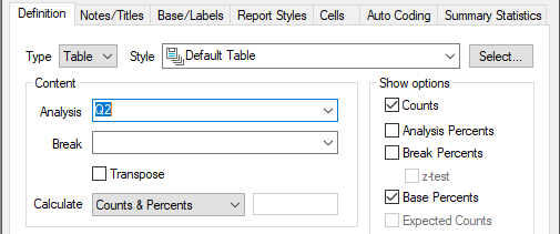
- Click Apply to display your table. You can use this to confirm that you have displayed the correct values on the chart.
2: Creating the bar chart
- Click Analysis Chart
 on the Snap XMP Desktop toolbar to create a chart.
 - Set the style to Bar Counts and set the analysis to Q2.
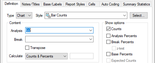
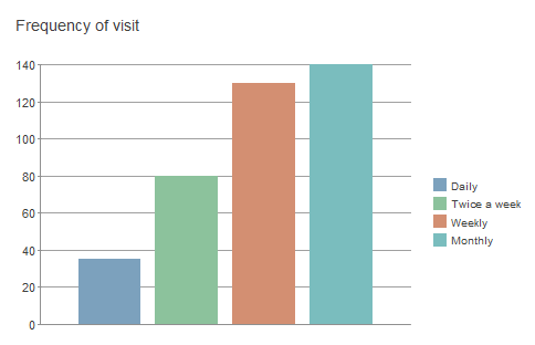
- Click Apply to display your chart. This shows a basic bar chart with no figures displayed on the bars.

- Click Edit Style on the chart toolbar. This opens the Chart Designer where you can change the appearance of the chart.
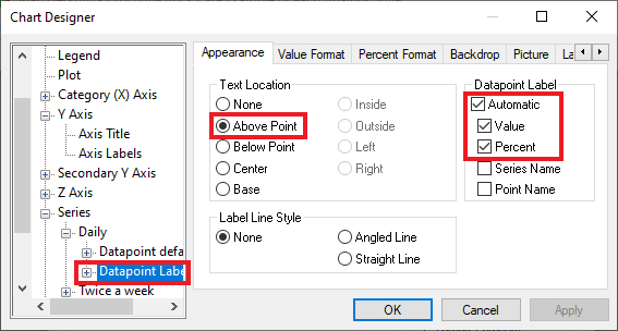
- In the chart elements list, click on Series then click on the Daily datapoint. Click on the Datapoint Label defaults.
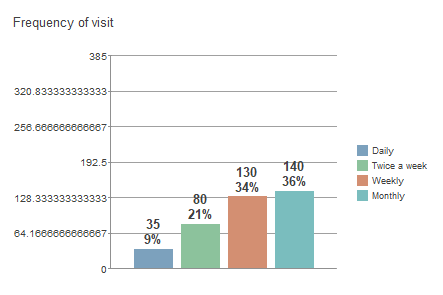
- In the Appearance tab, select Base to display the counts and percent at the top of the bar. In the Datapoint Label section select Automatic, Value and Percent.
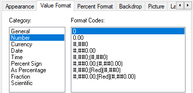
- In the Value Format tab, select Number and 0 to display whole numbers.
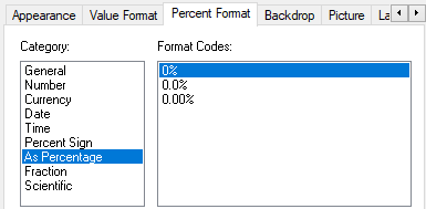
- In the Percent Format tab, select As Percentage and 0% to display percentages.
- Repeat this for all the datapoints.
- Click Apply to update the chart.
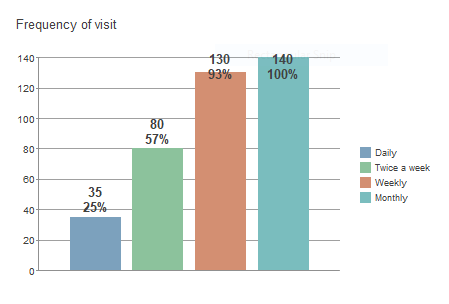
- Compare the percentage figures on the chart to the figures on the table. You will see that they do not match. This is because the figures on the chart are calculated automatically using the size of the largest bar. To make the figures display correctly, enter the base figure in the Chart Designer to use to calculate the percentages.
- In the Chart Designer click the Y Axis section. The scale is set automatically. Clear the Automatic check box then set the Maximum to the respondent base for the survey: 385 in this example.
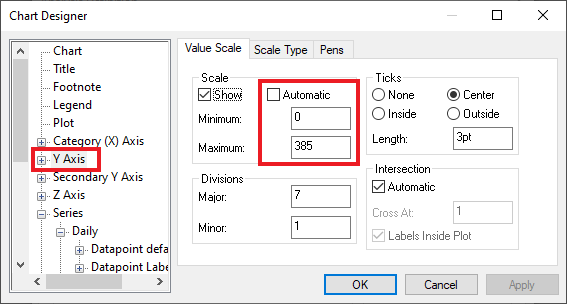
- Click Apply to update the chart. The percentage values displayed on the chart are now correct.

3: Changing the labels on the Y-axis
Sometimes the chart appears with an unnecessarily precise Y-axis labelling. You can choose to not display the Y-axis, or you can change the display of the labels, so they do not show decimal places.
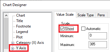
Hide the Y-axis
You can stop displaying the y-axis by clearing the Show box.
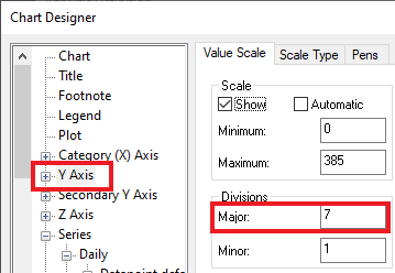
Changing the number of divisions on the Y-axis
Change the number of grid divisions to a factor of 385 (e.g., 7), so that no decimal places are needed. This is done by setting the value in the Major box under Divisions.
Format the Y-axis labels
- Select Axis Labels under Y Axis in the chart elements pane.
- Select the Format tab.
- Select the Number category and 0 as the Format Code.
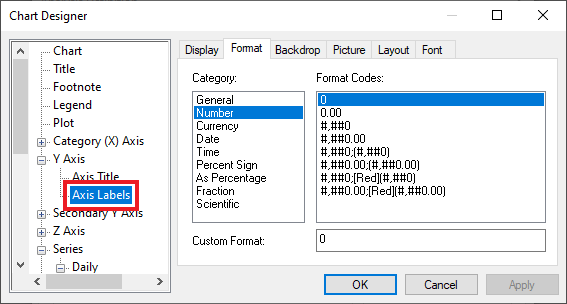
- Click OK.
Saving the style
You can save the chart style that you have just created by right clicking the chart and selecting Save Style from the context menu.
Further information
To find out more about how the Chart Designer works, see Using the Chart Designer.
There is a worksheet on creating your own chart styles: Use Chart styles to add branding to your charts.
If there is a topic you would like a tutorial on, email to snapideas@snapsurveys.com