Change category colours in charts
Charts play an important part in analysis and reporting, helping to make the response data easier to understand. You can create chart styles that reflect your organization’s branding, bringing a consistent look to your analysis and reports. Snap XMP Desktop provides a large number of predefined chart styles that you can use as supplied or as the basis for a new style. Some of these chart styles change the layout, background and colours, whereas others change only the colours. The supplied chart styles that only change the colour scheme start with the word Color.
This tutorial shows how to apply a new colour scheme to an existing chart, how to change the colour for individual chart categories, and how to save your custom chart style to use again.
Step 1: Apply a predefined colour scheme
In this example, a new colour scheme is applied to a horizontal bar chart of responses to a question grid.
- On the Snap XMP Desktop toolbar, click Analysis Chart
 to create a new chart.
 - In the Style list, select Horizontal Stacked Bar Percent Transposed.
- In the Analysis field, enter the grid questions.
- Select the options Analysis Percents and Transpose.
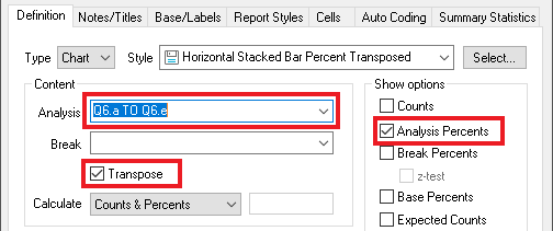
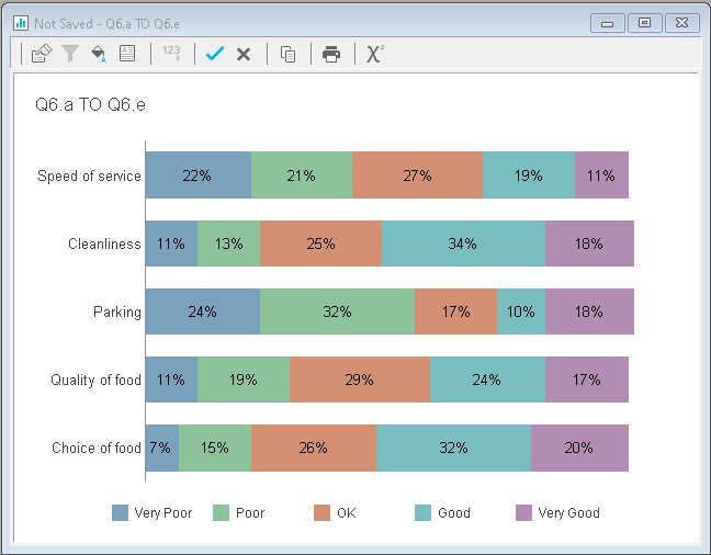
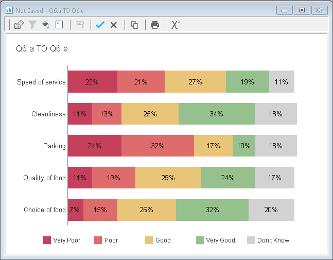
- Click Apply. The chart will look like this:
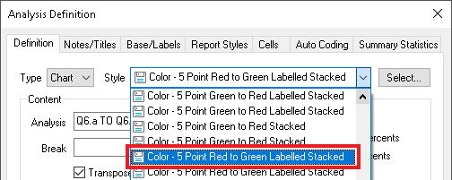
- In Style, select a new Colour style from the list, for example Color – 5 Point Red to Green Labelled Stacked
- Click OK. Your chart will now look like this:
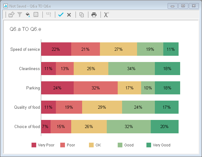
This example uses a 5 point scale; however there are colour schemes specifically designed for horizontal bar charts with 3 or 7 points, on both a positive to negative, and a negative to positive scale. There are black and white styles designed specifically for print, and styles with colours replicating those found in various versions of Excel. Colour styles can be applied to any chart, not just horizontal bar charts.
Step 2: Customise individual category colours
Category colours for any type of chart can be easily changed. In this example, the same colour style, Color – 5 Point Red to Green Labelled Stacked, is applied to a 4 point scale, which also includes a ‘Don’t Know’ option. In this context, the ‘traffic light’ colour labelling would be misleading. Changing the Don’t Know category colour from green to grey can show that this category is not included in the ratings. The same steps can be followed to change category colours in any style of chart.
- Double-click the area of the chart you would like to change, in this case the Don’t Know category. This opens the Chart Designer.
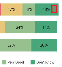
- The Chart Designer contains a number of options to change the appearance and content of your chart. Select Datapoint Defaults then select a new colour from the Fill section:
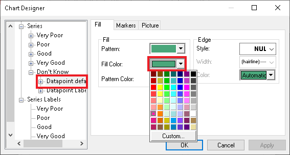
- Click OK to save the changes. The chart shows the new category colour.
Step 3: Save a style to use again
There are two options. You can either save the colour scheme, enabling you to apply the same colours to another chart in the future, or you can save the chart style including layout, background and colour scheme.
- Right-click anywhere in the chart area and select Save Style. This opens the Save Style As dialog.
- Choose a folder location and enter a file name for the chart style.
- In Style parts, select the parts of the custom style to include.
- To save just the colour scheme, select Series and clear Layout and Background
- To save the complete chart style, select Layout, Background and Series
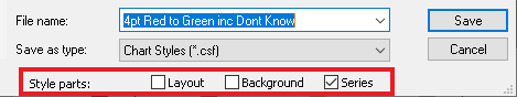
- Click Save to finish. You can now browse to select your saved chart style or colour scheme in the Analysis Definition.