Analysing data with crosstabs
You can find trends and patterns in your data by creating ordered crosstabs (cross tabulations) in Snap XMP Desktop. This is a quick way of analysing banded or coded variables.
Crosstabs are also known as contingency tables (or pivot tables). This tutorial shows you how to produce and order crosstabs then convert them to charts.
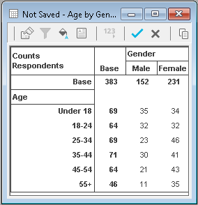
A crosstab is a table where the analysis field defines the rows and the break field gives the columns. This can be reversed by selecting the Transpose option.
The data in each cell shows the figure for the participants who fit into both the column and the row. The type and order of data displayed is given by the Show options.
You can order the rows by:
- the order the codes appear in the questionnaire, used for rating scales. This is the default order.
- alphabetical order by label
- popularity (sorted by quantity of responses)
- statistics you have included
Creating a simple crosstab
This example shows how to break down responses by gender. It uses data in the Crocodile Rock Cafe survey supplied with Snap XMP Desktop.
- On the Snap XMP Desktop toolbar, click Analysis Table
 to display the Analysis Definition dialog.
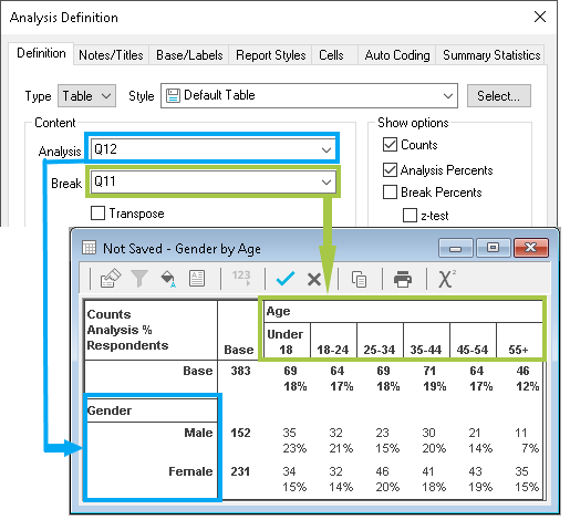
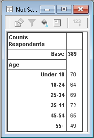
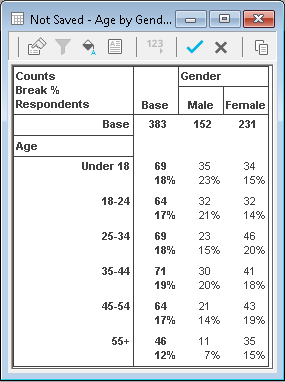
 - Type Q11 into the Analysis field (the age variable)
- Press OK to build a simple table showing the ages of the participants.
-
Click
 on the Analysis table toolbar to display the Analysis Definition dialog.
- Type Q12 into the Break field (the gender variable)
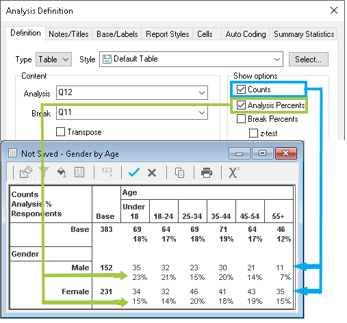
- Press Apply. The table now shows the values of Q11 as the row labels and the values of Q12 as the column labels across the top of the table.
- In the Analysis Definition dialog, select Break Percents, which shows each answer as a percentage of the column totals for the break variable (Q12).
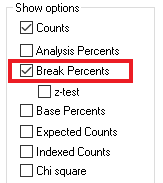
- Click Apply to update the table. The percentages are shown below the counts.
-
Click Save
 to save the table.
Creating an ordered crosstab
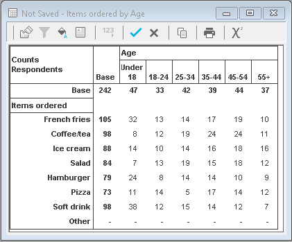
This example shows how to set out data so it’s easy to see which choices were most popular. The analysis shows which items were ordered (with a breakdown by age), and sorts them according to popularity.
- On the Snap XMP Desktop toolbar, click Analysis Table
 to display the Analysis Definition dialog.
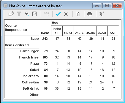
 - Type Q4 into the Analysis field (the food ordered)
- Type Q11 into the Break field (the age variable)
- Press OK. You will see a crosstab with the values of Q4 as the row labels on the left-hand side of the table and the values of Q11 as the column labels across the top of the table. The default row order is the order that the items were listed in the questionnaire. To make it easy to see which choice was the most popular, you can order the rows by the analysis value.
-
Click
 on the table toolbar to open the Analysis Definition dialog again.
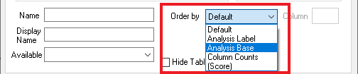
- In the Order by list, select Analysis Base then click Apply. Your table will update, with the rows sorted according to the number of responses. You can see that the French fries row has moved to the top.
-
Click Save
 to save the table.
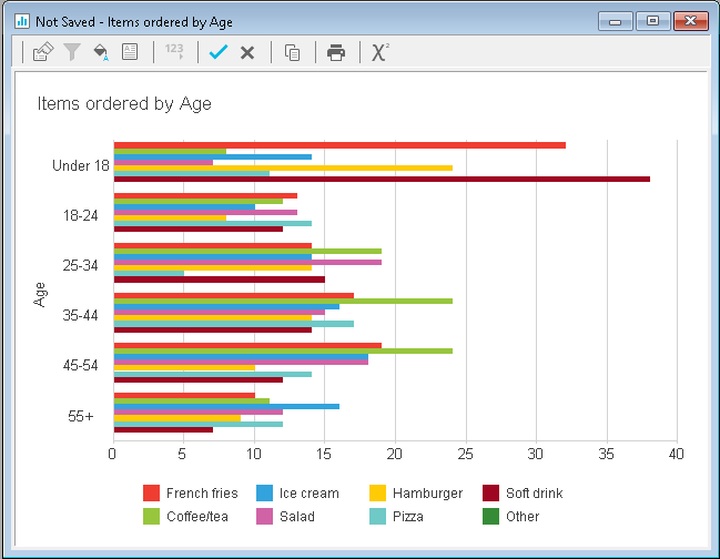
You can easily display your data in chart form. Open the Analysis Definition dialog and change the Type to Chart. The example below shows it with a style of Horizontal Bar Counts. You can see that the items ordered have been sorted by the Analysis base, with the most popular at the top.
Quickly building multiple crosstabs in a report
You can create a report of separate crosstabs using the same break (for example, break all the responses down by age or gender or both) with a single instruction in a report. The example below breaks down the questions by age.
-
Click
 to display the Reports window.
-
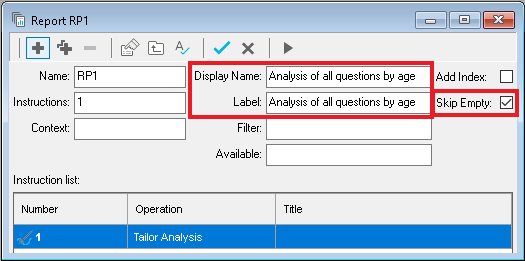
Click
 to create a new report. Set the labels to a description of your report and select Skip Empty to omit any empty analyses.
-
Click
 to create a new instruction and select Table in the Instruction List to display a Report instruction dialog.
- Complete the fields in the Definition tab:
- Analysis: Q2,Q4,Q6a TO Q6e
- Break: Q11
- Set the Order by dropdown to Default. Ordering is not appropriate for rating scales.
- The instruction will generate one crosstab for each question that you put in the analysis field. Literal, date and quantity questions have been excluded.
- Click OK to save the instruction.
-
Click
 on the Report window toolbar to open the Report execution dialog. Click Yes to save the report.
- Click Printer to choose a printer to print the report or choose to save the document to a PDF file or similar.
- Click OK to run the report and create the set of crosstabs.
Producing crosstabs filtered by demographic
You can also break down the data in your tables by using filters. This example shows how to produce a set of age tables for males and a set of age tables for females.
- Create a new report or duplicate the one you created in the previous step.
- Change the label of your new report to Analysis of all questions by age filtered by gender.
-
Click
 to create a new instruction and select Table in the Instruction List to display a Report instruction dialog.
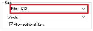
- Enter Q12 (gender) in the filter field.
- Click OK to save the instruction.
-
Click
 to open the Report execution dialog. Click Yes to save the report.
- Click OK to run the report and create the set of crosstabs.
- You will have two versions of all the question tables, one for each gender in Q12.
You can convert all the tables to charts by changing the instruction type and style.
If there is a topic you would like a tutorial on, email to snapideas@snapsurveys.com